Purpose: The Form Builder module is a dynamic low-code form creation framework available inside Advaita CRM. The module is designed for creating, configuring, publishing, and managing enterprise-grade forms used for customer onboarding, lead management, workflow automation, surveys, registrations, feedback collection, and operational processes.
Module Supports
- Manual form creation
- AI-assisted form generation
- Multi-section and multi-page layouts
- Advanced field configuration
- Workflow integration
- Submission tracking
- Role-based access management
- Validation and draft management
- Reusable OptionSets and templates
Note: The Form Builder is the central hub for all form creation and management in Advaita CRM. All form types — from lead intake to surveys — are created and managed here.
Navigation: Left Sidebar → Workflow & Forms → Form Builder
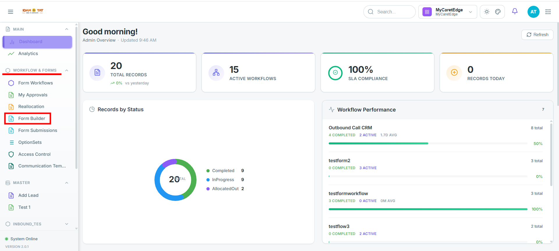
After opening the module, the system redirects to the Forms landing page.
Form Builder Landing Page
This page acts as the centralized repository for all forms configured within the CRM environment.
The page subtitle displayed is:
"Create and manage dynamic forms for data collection."
- Create with AI — Generate a form automatically using AI
- + Create Form — Manually create a new form
Search & Filter Controls
- Search Forms — Keyword search across form names
- Status Filter — Filter by Draft / Active / Inactive
- Category Filter — Filter by form category
- Clear Filters — Reset all active filters
- Name — Form identifier and display name
- Status — Current lifecycle status (Draft / Active)
- Category — Business category assigned to the form
- Submissions — Total submission count
- Views — Total view count
- Created Date — Date the form was created
- Action Menu — 3-dot menu for Edit, Duplicate, Delete, and more
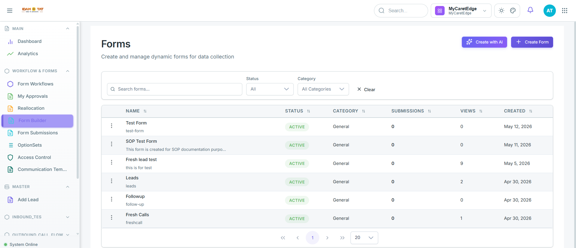
Click the “+ Create Form” button located in the top-right section of the landing page.
Step 2: Open the Configuration Modal
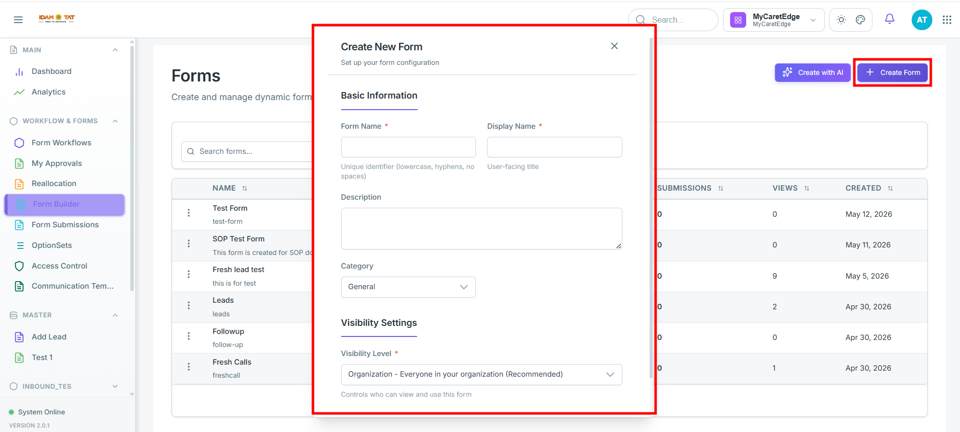
The “Create New Form” modal window will open with the subtitle "Set up your form configuration."
Configure the general form properties in the modal window:
| Field |
Required |
Description |
| Form Name |
✅ Yes |
Internal system identifier. Recommended naming format: lowercase with hyphens (e.g., lead-intake-form). |
| Display Name |
✅ Yes |
User-facing form title visible to end users. |
| Description |
❌ No |
Internal business description or notes about the form's purpose. |
| Category |
❌ No |
Business category classification. Options include: General, Survey, Registration, Application, and Feedback. |
Step 4: Set the Visibility Level
Specify who can access and interact with the published form using the visibility level configuration:
| Field |
Required |
Description |
| Visibility Level |
✅ Yes |
Determines access control and permissions:
• User: Only the creator can access the form.
• Role: Accessible to users with a specific role.
• Hierarchy: Accessible based on hierarchical assignment.
• Organization: Accessible to the entire organization.
• Tenant: Tenant-wide visibility across all organizations. |
Note: Choose the visibility level carefully — it determines who can view, access, and interact with the form once it is published.
Click the “Create Form” button to initialize the form and load the Form Builder designer canvas.
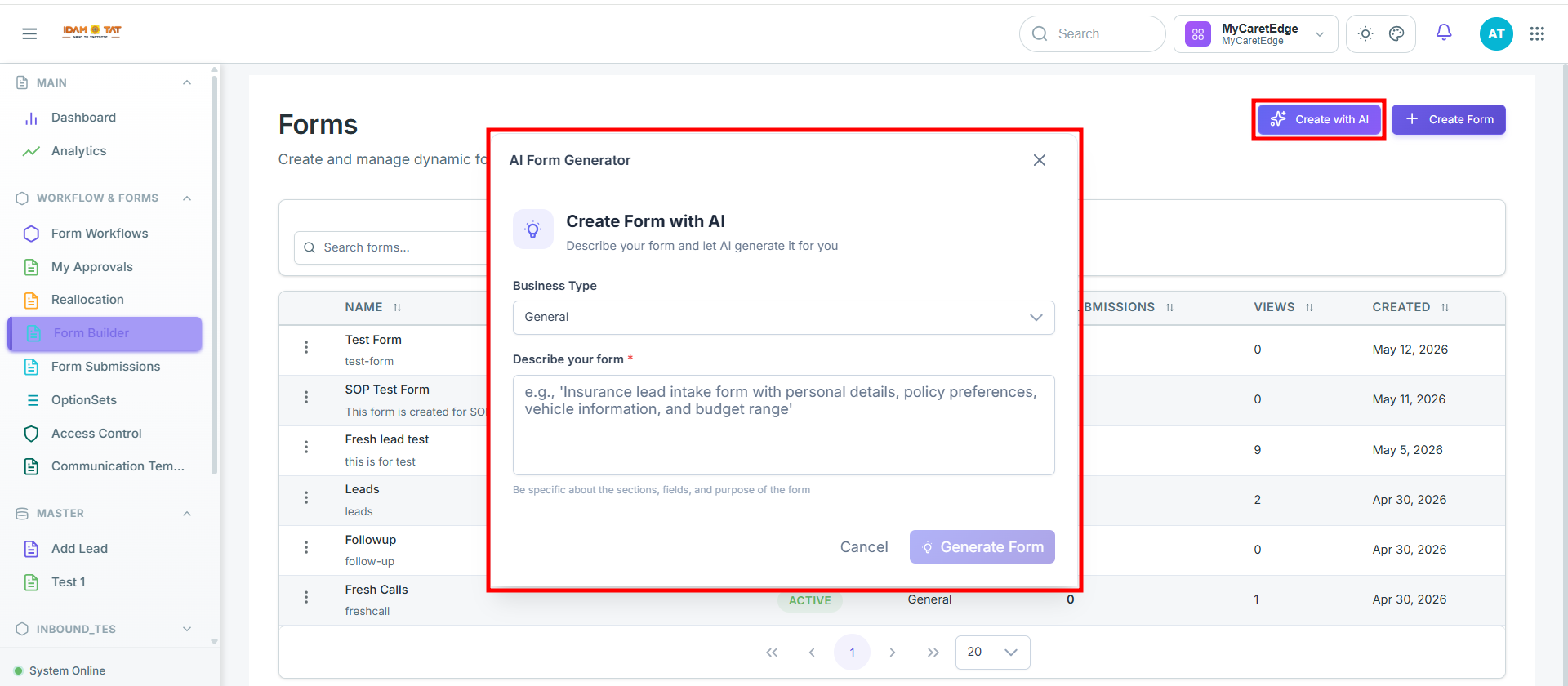
The platform supports AI-assisted form generation for faster setup.
Step 1: Click Create with AI.
Click the “Create with AI” button located in the top-right section of the landing page.
Step 2: Select Business Type.
Select the Business Type from the dropdown menu.
Type a description of the form you want to create.
Example prompt: "Insurance lead intake form with personal details, policy preferences, vehicle information, and budget range."
Click on the generate form to generate the form.
The AI engine automatically generates:
- Sections
- Panels
- Suggested fields
- Input layouts
Tip: The more specific your description, the more accurate the generated form structure will be. You can further edit the AI-generated form in the Form Builder Editor.
Form Builder Layout Page
Once the form is created, the user is automatically redirected to the Form Builder Layout page — the central workspace where the form is designed and configured.
The Form Builder layout is divided into four major areas:
Area 1
Top Toolbar
Full width — sits at the top
← Back
Edit name
Status badge
Undo / Redo
Export
Preview
Save
Settings
Publish
⋮ Duplicate · Export JSON · Version History · Shortcuts
Area 2
Left Panel
Field Library
Text fields
Numbers
Selection
Date & time
Lookups
Location
Media & files
Ratings
Interactive
Advanced
Layout
Card Library
Location
Approval
Escalation
Layout
Metadata
Communication
Resources
Data access
Master link
Reminders
Unique fields
Notification
Dataset history
Area 3
Central Canvas
Section 1
⊕
Drag fields here or click a field in the palette
+ Add Section
⊞ Quick Add Section
Area 4
Right Properties Panel
Section header
› · ⚖ · ✕
General
Title · Subtitle · Desc · Icon
Page
No. · Title · Desc · Icon
Layout
Columns · Panels · Width
Appearance
Header · Borders · BG · Theme
Help
help text, Instruction
Behavior
Visible · Read only · Collapsible
Condition
Visibility · Enablement
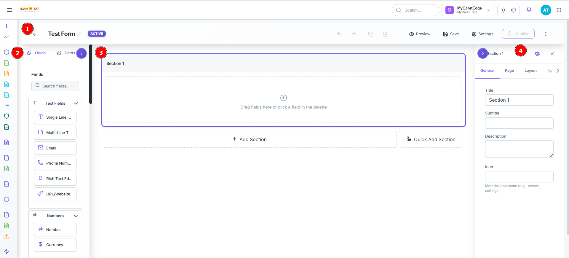
Forms follow a hierarchical structure:
Form
 └── Section
       └── Panel
             └── Fields
| Level |
Description |
| Section |
Logical grouping container for related panels |
| Panel |
Layout container used for column management within a section |
| Fields |
Individual user input components for data collection |
The form comes with a default Section 1 already available on the canvas. Additional sections can be added as needed to organize the form into logical groups.
Configuring a Section
To configure a section, click on the section and use the Right-Side Properties Panel which contains the following tabs:
Click the section to open the right-side properties panel, then configure each tab:
Step 1 — General
Define the section's identity by filling in the Title, Subtitle, Description, and Icon (use a Material icon name, e.g. person).
Step 2 — Page (for multi-page forms only)
Set the Page Number to define its order, then add a Page Title, Page Description, and Page Icon for navigation.
Step 3 — Layout
Control how fields are arranged using Column Structure, Panel Arrangement (1, 2, or 3 panels), Width Allocation, and Layout Style.
Step 4 — Appearance
Style the section visually with Header Styling (font, size, style), Borders, Background Color, and Theme Palette.
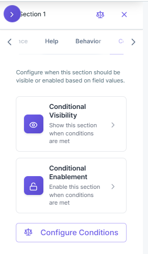
Step 5 — Condition
Control when the section is active:
- Visibility — show or hide the section when a condition is met
- Enablement — keep the section visible but disable interaction until a condition is met
steps to configure section condition:
- Select the Condition tab from the right-side properties panel
- Configure the following options:
- Condition Visibility — define a condition to show or hide the section entirely based on whether the condition is met
- Condition Enablement — define a condition to enable or disable the section; the section remains visible on the form but stays disabled (non-interactive) until the specified condition is met
Panel Settings inside a section
Click on a panel within the section to configure its properties.
Panel-Level Layout & Settings
Once a Section is created, you must configure the Panels inside it. A panel acts as a layout container that hosts individual input fields.
- Accessing Panel Settings: Click directly on a panel within your section to open its properties panel on the right side of the screen.
- Settings Tabs: Just like sections, panels have properties grouped into General (naming), Appearance (styling/borders/padding), and Conditions (conditional visibility rules to show/hide the entire panel).
- Defining the Layout: Specify how fields inside the panel are arranged:
- Panel Layout: Select whether the panel is arranged in columns or rows.
- Column Count: Define the grid system (e.g., 1, 2, or 3 columns) to arrange fields side-by-side.
- Width Configuration: Distribute width percentages across columns to optimize space.
- Defining Question Sets: Panels act as placeholders for question sets. You populate these sets by dragging input fields from the Left Field Library and dropping them into the panel's active drop zone.
Step to configure Layout
-
Click Layout in the right panel, then choose a Section Layout Mode — either Columns or Panels.
-
Option 1 — Columns
- Select the number of columns — 1, 2, or 3
- Set the width for each column (total must equal 100%)
- Drag and drop fields into each column
Example: 3 columns → 33% / 33% / 33%
- Option 2 — Panels
- Select the panel layout — Single, Two, or Three panels
- Set the width distribution across the panels (total must equal 100%)
- Drag and drop fields into each panel
Example: Two panels → 40% / 60%
Both options let you control how fields are visually grouped and arranged within the section. Use Columns for a uniform grid layout and Panels for distinct grouped sections.
Steps for Adding Fields into the panel
- From the Left Panel, select the desired field type.
- Drag and drop the field into the target section/panel on the canvas.
- The Field Configuration Panel opens on the right side.
- Configure the field using the tabs available.
Example: Creating a Dropdown Field
Step 1: From the Fields panel, select the Dropdown field type.
Step 2: Drag and drop the field into the required section/panel.
Step 3: The Field Configuration Panel opens on the right side.
Step 4: Under the General tab, locate the Label field and replace the default with: Is this a Valid Lead?
Step 5: Navigate to the Options tab.
Step 6: Locate Option Source and select the appropriate source type.
| Option Source |
When to Use |
How it Works |
Real-World Example |
| Static |
Small, fixed lists |
Manually add options one by one (e.g., Valid Lead, Invalid Lead, Follow-up Required) |
Yes / No choices, or Valid Lead / Invalid Lead / Follow-up Required. |
| Option Set |
Reusable enterprise-wide values |
Select an existing Option Set maintained centrally in the system |
Global lists like US States, Country Codes, or standard Lead Statuses. |
| Data Set |
CRM or database-driven values |
Fetch values dynamically from a configured internal dataset |
A dropdown showing active Sales Representatives or currently available Product SKUs. |
| API |
Real-time external integration |
Configure an API endpoint; values populate dynamically from external systems |
A dropdown populating real-time Zip Code details or External Inventory levels. |
Recommended Usage:
- Use Static for small, fixed lists.
- Use Option Set for standardized values shared across multiple forms.
- Use Data Set when values come from internal CRM or database records.
- Use API for real-time integration with external platforms.
Tip: Performance Guideline: Always prefer Option Set or Static for simple lists to avoid unnecessary database queries or external API calls, which can impact page load times. Use Data Set or API only when the choices are volatile and must represent live data.
Section Configuration(Center Panel)
Section Management — Adding, Editing & Organizing
- Default Setup: A default Section 1 is automatically created with every new form.
- Selecting a Section: Click directly on the section layout to focus it; this action instantly opens the Right-side Properties Panel.
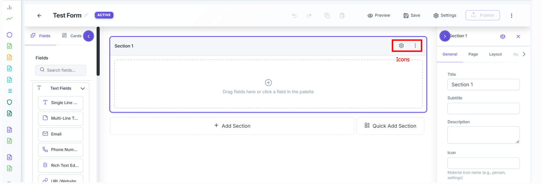
- Icons: Hover over the active section tab (e.g., Section 1) to reveal two quick-access icons:
- Settings (gear) icon — clicking this launches the same right-side properties panel for configuring the section's title, subtitle, description, and so on.
- More Options (⋮ three-dot) menu — clicking this reveals the following actions:
- Duplicate Section — creates an exact copy of the section including all its fields
- Move Up — shifts the section one position up in the form order
- Move Down — shifts the section one position down in the form order
- Delete Section — permanently removes the section and all its fields from the form
- Adding Additional Sections To grow your form layout, you can add new sections using two main options:
- + Add Section: Appends a blank section to the form canvas for custom field design.
- Quick Add Section: Speeds up form building by immediately adding pre-populated, commonly used section templates, including:
- Phone Number: A section pre-configured with a formatted telephone input field.
- Email Address: A section pre-configured with email input validation.
- Address: A multi-field layout block designed to collect complete mailing details (Street, City, State, Zip Code).
- Web Links: A section tailored for capturing external URLs or website addresses.
- Contact Details: A comprehensive personal information block that groups essential contact fields (such as Name, Phone, and Email) into a single unified layout.
Configuring a Section using the Right Panel
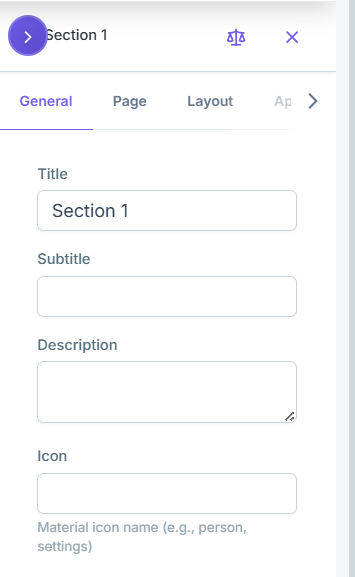
Click directly on the section layout to focus it; this action instantly opens the Right-side Properties Panel. or clicking on settings icon on section header will also open the right side properties panel.
General Tab
| Property |
Description |
| Title |
Section heading visible to users |
| Subtitle |
Secondary heading below the title |
| Description |
Contextual description for the section |
| Icon |
Optional icon for visual identification |
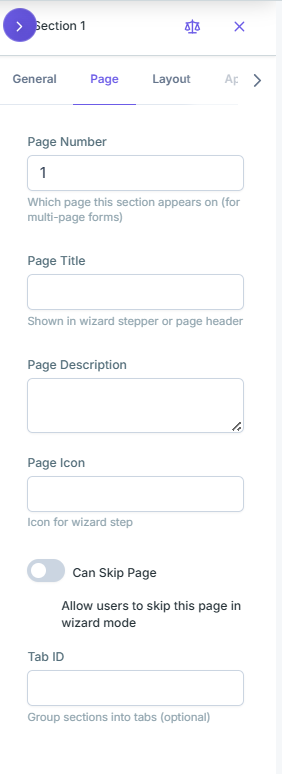
Page Tab (for multi-page forms)
| Property |
Description |
| Page Number |
Assigns the section to a specific page |
| Page Title |
Title displayed for that page |
| Page Description |
Description shown at the top of the page |
| Page Icon |
Icon for the page tab |
| Can Skip Page |
toggle option to allow users to skip this page in wizard mode |
| Tab ID |
Unique identifier for the page tab |
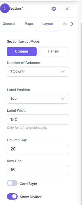
Layout Tab
This tab manages the section's Panel configurations, allowing users to define the layout as either columns or panels based on their requirements.
| Property |
Description |
| Section Layout Mode |
Defines the structure of the section. Options include:
• Columns: Select the number of columns from the dropdown
• Panel: Select panel layout (1 Panel / 2 Panels / 3 Panels) |
| Label Position |
Select the label position from the dropdown |
| Label Width |
Select the label width from the dropdown |
| Column Gap |
Text box to type in the gap between columns |
| Row Gap |
Text box to type in the gap between rows |
| Card Style |
Toggle option to apply card styling |
| Show Divider |
Toggle option to display a divider |
Appearance Tab
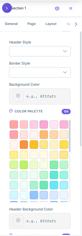
| Property |
Description |
| Header Styling |
select the style for the section header from the dropdown |
| Border Style |
select the style for the section border from the dropdown |
| Background Color |
choose the background color from the color palette |
| Header Background Color |
choose the background color for the section header from the color palette |
| Shadow |
Select the shadow from the dropdown |
| Padding |
Select the Padding from the Dropdown |
Help
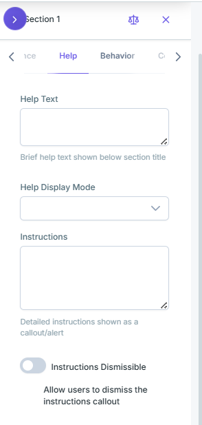
| Property |
Description |
| Help Text |
Brief help text shown below section title |
| Help Display Mode |
Select the Help Display Mode from the dropdown |
| Instructions |
Detailed instructions shown as a callout/alert |
| Instructions Dismissible |
toggle option allows users to dismiss the instructions callout |
Behavior
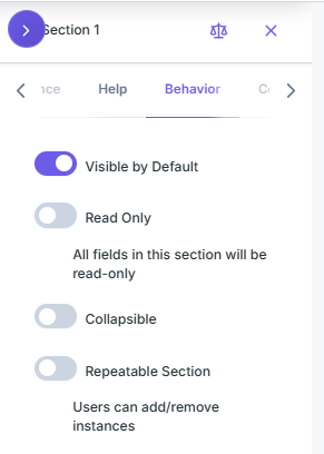
| Property |
Description |
| Visible by Default |
toggle option allows users to view the section by default |
| Read Only |
toggle option allows users to edit the fields in the section |
| Collapsible |
toggle option allows users to collapse the section |
| Repeatable Section |
toggle option allows users to add/remove instances of the section |
Conditions
Configure when this section should be visible or enabled based on field values.
| Condition Type |
Description |
| Condition Visibility |
Show or hide the section based on a condition.
Section Conditional Logic (Visibility):
• Define when this section should be visible based on field values.
• Uses AND logic within groups, OR logic between groups.
• Click + Add Condition to get started.
• Click Apply Changes to save or Cancel to discard. |
| Condition Enablement |
Section remains visible but disabled until the condition is met.
Section Conditional Logic (Enablement):
• Define when this section's fields should be editable.
• Disabled sections display as read-only with an overlay.
• Click + Add Condition to get started.
• Click Apply Changes to save or Cancel to discard. |
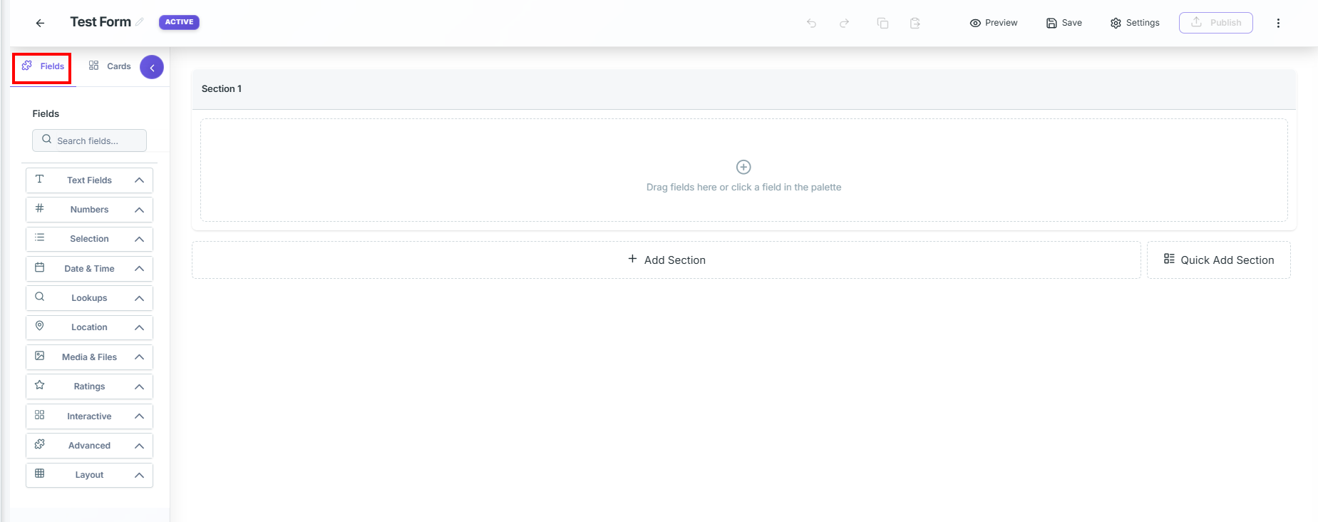
Detailed Explaination of Left Panel
1. Fields
The left-side Panel contains allthe fields and cards Library .
User can drag and drop these fields onto the form canvas
Detailed Explanation of Field Types
🔤
Text Fields
Configure text-based input fields such as single line, multiline, email, phone number, and rich text editors.
Single Line Text Input
General
- Label: Display name shown to end users
- Placeholder: Hint text inside field before input
- Help Text: Guidance shown below the field
- Tooltip: Info shown on hover beside the label
- Show Label: Toggle label visibility. Enabled by default
- Label Position: Top · Left · Right · Floating
- Default Value: Pre-filled value on form load
Properties
- Min Length: Minimum characters required
- Max Length: Default:
255. 0 = Unlimited
- Input Mask / Pattern:
# = Digit, A = Alphabet
- Enable Masking: Masks displayed value without changing stored data. Disabled by default
- Mask Direction: All Characters · Left (+ Characters to Mask) · Right (+ Characters to Mask) · Middle (+ Start & End Position)
- Mask Character: Bullet
• · Asterisk * · Letter X · Hash #
Layout
- Width: 1 Column · 2 Columns · 3 Columns
- Start New Row: Moves field to a new row. Disabled by default
- Size: Small · Medium · Large
- CSS Classes: Space-separated custom class names
Metadata
- Enable Metadata Pre-fill: Auto pre-fills using ETL or API when a
recordId is provided. Disabled by default
- ETL Dataset (Default): Choose dataset → auto-fills field from matching record
- API Endpoint: API URL (supports
{recordId}) · HTTP Method (GET / POST) · Response Path (JSON path to extract value)
Permissions
- Role-Based Access: Control visibility and edit access by role
- Add Role: Select roles from dropdown. Per role: Visible · Editable · Required · Delete
- Mark as PII / Sensitive Data: Flags field as personal, financial, or confidential
Multi Line Text Input
General
- Label: Display name shown to end users
- Placeholder: Hint text inside the input box before user enters a value
- Help Text: Guidance shown below the field
- Tooltip: Info shown on hover beside the label
- Show Label: Toggle label visibility. Enabled by default
- Label Position: Top · Left · Right · Floating
- Default Value: Pre-filled value on form load
Properties
- Row Count: Number of rows displayed; adjustable via arrows
- Max Length: Default:
2000. 0 = Unlimited
- Auto-growth Height: Toggle to enable auto-expansion of field height
- Show Character Count: Toggle to show/hide character count
Layout
- Width: 1 Column · 2 Columns · 3 Columns
- Start New Row: Moves field to a new row. Disabled by default
- Size: Small · Medium · Large
- CSS Classes: Space-separated custom class names
Metadata
- Enable Metadata Pre-fill: Auto pre-fills using ETL or API when a
recordId is provided. Disabled by default
- ETL Dataset (Default): Choose dataset → auto-fills field from matching record
- API Endpoint: API URL (supports
{recordId}) · HTTP Method (GET / POST) · Response Path (JSON path to extract value)
Permissions
- Role-Based Access: Control visibility and edit access by role
- Add Role: Select roles from dropdown. Per role: Visible · Editable · Required · Delete
- Mark as PII / Sensitive Data: Flags field as personal, financial, or confidential
Email
General
- Label: Display name shown to end users
- Placeholder: Hint text inside the input box before user enters a value
- Help Text: Guidance shown below the field
- Tooltip: Info shown on hover beside the label
- Show Label: Toggle label visibility. Enabled by default
- Label Position: Top · Left · Right · Floating
- Default Value: Pre-filled value on form load
Properties
- Allow Multiple Emails: Toggle to allow multiple email entries. Disabled by default
- Allowed Domains: Restrict submissions to specific domains. Enter comma-separated values (e.g.,
gmail.com, yahoo.com). Leave empty to allow all domains
Layout
- Width: 1 Column · 2 Columns · 3 Columns
- Start New Row: Moves field to a new row. Disabled by default
- Size: Small · Medium · Large
- CSS Classes: Space-separated custom class names
Metadata
- Enable Metadata Pre-fill: Auto pre-fills using ETL or API when a
recordId is provided. Disabled by default
- ETL Dataset (Default): Choose dataset → auto-fills field from matching record
- API Endpoint: API URL (supports
{recordId}) · HTTP Method (GET / POST) · Response Path (JSON path to extract value)
Permissions
- Role-Based Access: Control visibility and edit access by role
- Add Role: Select roles from dropdown. Per role: Visible · Editable · Required · Delete
- Mark as PII / Sensitive Data: Flags field as personal, financial, or confidential
Phone Number
General
- Label: Display name shown to end users
- Placeholder: Hint text inside the input box before user enters a value
- Help Text: Guidance shown below the field
- Tooltip: Info shown on hover beside the label
- Show Label: Toggle label visibility. Enabled by default
- Label Position: Top · Left · Right · Floating
- Default Value: Pre-filled value on form load
Properties
- Default Country Code: Select default dialing code from dropdown (e.g.,
+1 USA, +91 India, +44 UK)
- Phone Format: International (e.g.,
+91 9876543210) · National (e.g., 9876543210) · Digits Only (numeric only)
- Show Country Code Selector: Allows users to select/change country code while entering number. Disabled by default
Layout
- Width: 1 Column · 2 Columns · 3 Columns
- Start New Row: Moves field to a new row. Disabled by default
- Size: Small · Medium · Large
- CSS Classes: Space-separated custom class names
Metadata
- Enable Metadata Pre-fill: Auto pre-fills using ETL or API when a
recordId is provided. Disabled by default
- ETL Dataset (Default): Choose dataset → auto-fills field from matching record
- API Endpoint: API URL (supports
{recordId}) · HTTP Method (GET / POST) · Response Path (JSON path to extract value)
Permissions
- Role-Based Access: Control visibility and edit access by role
- Add Role: Select roles from dropdown. Per role: Visible · Editable · Required · Delete
- Mark as PII / Sensitive Data: Flags field as personal, financial, or confidential
Rich Text Editor
General
- Label: Display name shown to end users
- Placeholder: Hint text inside the input box before user enters a value
- Help Text: Guidance shown below the field
- Tooltip: Info shown on hover beside the label
- Show Label: Toggle label visibility. Enabled by default
- Label Position: Top · Left · Right · Floating
- Default Value: Pre-filled value on form load
Layout
- Width: 1 Column · 2 Columns · 3 Columns
- Start New Row: Moves field to a new row. Disabled by default
- Size: Small · Medium · Large
- CSS Classes: Space-separated custom class names
Metadata
- Enable Metadata Pre-fill: Auto pre-fills using ETL or API when a
recordId is provided. Disabled by default
- ETL Dataset (Default): Choose dataset → auto-fills field from matching record
- API Endpoint: API URL (supports
{recordId}) · HTTP Method (GET / POST) · Response Path (JSON path to extract value)
Permissions
- Role-Based Access: Control visibility and edit access by role
- Add Role: Select roles from dropdown. Per role: Visible · Editable · Required · Delete
- Mark as PII / Sensitive Data: Flags field as personal, financial, or confidential
URL/Website
General
- Label: Display name shown to end users
- Placeholder: Hint text inside the input box before user enters a value
- Help Text: Guidance shown below the field
- Tooltip: Info shown on hover beside the label
- Show Label: Toggle label visibility. Enabled by default
- Label Position: Top · Left · Right · Floating
- Default Value: Pre-filled value on form load
Properties
- Allowed Protocols: Select one or more protocols from dropdown (e.g.,
https, ftp, mailto, tel)
- Validate URL Format: Validates the entered URL. Enabled by default
Layout
- Width: 1 Column · 2 Columns · 3 Columns
- Start New Row: Moves field to a new row. Disabled by default
- Size: Small · Medium · Large
- CSS Classes: Space-separated custom class names
Metadata
- Enable Metadata Pre-fill: Auto pre-fills using ETL or API when a
recordId is provided. Disabled by default
- ETL Dataset (Default): Choose dataset → auto-fills field from matching record
- API Endpoint: API URL (supports
{recordId}) · HTTP Method (GET / POST) · Response Path (JSON path to extract value)
Permissions
- Role-Based Access: Control visibility and edit access by role
- Add Role: Select roles from dropdown. Per role: Visible · Editable · Required · Delete
- Mark as PII / Sensitive Data: Flags field as personal, financial, or confidential
🔢
Numbers
Numeric fields for integers, decimals, currency, percentages, calculations, and measurements.
Number
General
- Label : Display name of the field shown to end users
- Placeholder : Hint text displayed inside the input box before the user enters a value
- Help Text : Additional guidance shown below the field
- Tooltip : Text shown when hovering over the tooltip icon beside the label
- Show Label : Toggle to show or hide the field label. Enabled by default
- Label Position : Select the display position of the label from the dropdown .
- Default Value : Pre-filled value when the form loads
Properties
- Minimum Value : Defines the smallest number allowed in the field.Users cannot enter a value lower than the configured limit.
- Maximum Value : Defines the largest number allowed in the field.Users cannot enter a value greater than the configured limit.
- Step : Defines the increment or decrement interval used when increasing or decreasing the value. Example: Step value
1 increases numbers by 1, while 0.5 increases by 0.5.
- Allow Negative Numbers : Toggle option disabled by default. When enabled, users can enter negative values such as
-10.
- Use Thousand Separator : Toggle option disabled by default. When enabled, large numbers are automatically formatted using separators for better readability. Example:
1000000 → 1,000,000
Layout
- Width : Defines how much horizontal space the field occupies within the form layout.
- 1 Column : Field occupies one column width
- 2 Columns : Field spans across two columns
- 3 Columns : Field spans across three columns
-
Start New Row : Toggle option disabled by default.When enabled, the field automatically moves to a new row instead of appearing beside other fields.
-
Size : Controls the visual height and spacing of the field.
- Small : Compact field size
- Medium : Standard default size
- Large : Larger field for better visibility and accessibility
- CSS Classes : Allows adding custom CSS class names for styling and layout customization. Multiple class names can be added separated by spaces.
Metadata
Configure automatic field pre-fill using ETL datasets or external API sources when a recordId is provided.
- Enable Metadata Pre-fill : Toggle option disabled by default
When enabled, the Data Source Type option appears:
-
ETL Dataset (Default Selected)
- Fetches data from an internal ETL dataset
- Select Dataset : Choose the required dataset
- When a
recordId is provided, the system searches the selected dataset and automatically fills the field using the matching record value
-
API Endpoint
- Fetches data dynamically from an external API
- API URL : Supports dynamic
{recordId} placeholder
-
HTTP Method
- Response Path : JSON path used to extract the required value from the API response
Permissions
- Role-Based Access : Control field visibility and edit access by role
- Add Role : Select roles from the dropdown
For each selected role:
- Visible : Role can view the field
- Editable : Role can modify the field
- Required : Field becomes mandatory for the role
- Delete Option : Remove the role configuration
Click on + Add Role to add multiple roles.
-
Mark as PII / Sensitive Data
- Marks the field as sensitive information such as personal, financial, or confidential data
Currency
General
- Label : Display name of the field shown to end users
- Placeholder : Hint text displayed inside the input box before the user enters a value
- Help Text : Additional guidance shown below the field
- Tooltip : Text shown when hovering over the tooltip icon beside the label
- Show Label : Toggle to show or hide the field label. Enabled by default
- Label Position : Select the display position of the label from the dropdown .
- Default Value : Pre-filled value when the form loads
Properties
- Currency Symbol : Select the currency symbol to display with the entered value. Example:
₹, $, €, £
- Symbol Position : Defines where the currency symbol appears relative to the amount.
- Left : Example
₹500
- Right : Example
500₹
- Decimal Places : Defines the number of decimal digits allowed after the decimal point. Example:
2 → 100.50
- Use Thousand Separator : Toggle option disabled by default. When enabled, large numbers are automatically formatted using separators for better readability. Example:
1000000 → 1,000,000
Layout
-
Width : Defines how much horizontal space the field occupies within the form layout.
- 1 Column : Field occupies one column width
- 2 Columns : Field spans across two columns
- 3 Columns : Field spans across three columns
-
Start New Row : Toggle option disabled by default. When enabled, the field automatically moves to a new row instead of appearing beside other fields.
-
Size : Controls the visual height and spacing of the field.
- Small : Compact field size
- Medium : Standard default size
- Large : Larger field for better visibility and accessibility
-
CSS Classes : Allows adding custom CSS class names for styling and layout customization. Multiple class names can be added separated by spaces.
Metadata
Configure automatic field pre-fill using ETL datasets or external API sources when a recordId is provided.
- Enable Metadata Pre-fill : Toggle option disabled by default
When enabled, the Data Source Type option appears:
-
ETL Dataset (Default Selected)
- Fetches data from an internal ETL dataset
- Select Dataset : Choose the required dataset
- When a
recordId is provided, the system searches the selected dataset and automatically fills the field using the matching record value
-
API Endpoint
- Fetches data dynamically from an external API
- API URL : Supports dynamic
{recordId} placeholder
-
HTTP Method
- Response Path : JSON path used to extract the required value from the API response
Permissions
- Role-Based Access : Control field visibility and edit access by role
- Add Role : Select roles from the dropdown
For each selected role:
- Visible : Role can view the field
- Editable : Role can modify the field
- Required : Field becomes mandatory for the role
- Delete Option : Remove the role configuration
Click on + Add Role to add multiple roles.
-
Mark as PII / Sensitive Data
- Marks the field as sensitive information such as personal, financial, or confidential data
☑️
Selection
Selection controls including dropdowns, radio buttons, checkboxes, multiselects, and picklists.
Dropdown
General
- Label : Display name of the field shown to end users
- Placeholder : Hint text displayed inside the input box before the user enters a value
- Help Text : Additional guidance shown below the field
- Tooltip : Text shown when hovering over the tooltip icon beside the label
- Show Label : Toggle to show or hide the field label. Enabled by default
- Label Position : Select the display position of the label from the dropdown .
- Default Value : Pre-filled value when the form loads
Properties
- Enable Search/Filter : Toggle option disabled by default. When enabled, users can search and filter options in the dropdown
Options
- Options Source : Select the source of the options from the dropdown .
- static
- option set
- dataset
- api
- 1. Static
- Click + Add Option to manually enter a Label and Value. Repeat to add multiple options.
- To add in bulk, click Import CSV → upload your CSV file.
- Use Download Sample Format to get the correct template before uploading.
- 2. Option Set
- Select an existing option set from the dropdown, or click Create New to open a new tab with two sections:
- Details Tab
- Internal Name — Unique identifier (e.g.
countries) — no spaces, lowercase recommended
- Display Name — User-friendly name shown in UI (e.g.
Country List)
- Description — Brief description of this option set
- Category — Group related option sets together
- Organization-wide (Global) — Make this option set available across all forms
- Sort Alphabetically — Auto-sort options by label
- Allow Runtime Additions — Let users add new options while filling the form
- Hierarchical (NEW) — Enables parent → child trees (e.g. Country → State → City). Bind a Dropdown / Listbox / Cascading Dropdown field and set Cascade Mode → Option-Set Hierarchy to walk the tree. Recommended for 50k+ values.
- Options Tab
- Click + Add Option to enter a Label and Value. Repeat for multiple options.
- Or use Import CSV to upload options in bulk.
- 3. Dataset
- Select Dataset — Choose an ETL table from the dropdown to use as the options source.
- 4. API
- API Endpoint URL — External API URL to fetch options from (e.g.
https://api.example.com/options)
- HTTP Method — Select
GET or POST
- Label JSONPath — Path to the label field in the JSON response (e.g.
label)
- Value JSONPath — Path to the value field in the JSON response (e.g.
value)
- Click Test Connection to verify the API is reachable and returning data correctly.
Cascade
- Configure this dropdown to filter its options based on another dropdown's selection.
Example: Country → State → City cascading relationship.
- Enable Cascade from Parent Field — Toggle (disabled by default). When enabled, the dropdown options are filtered based on another dropdown's selection.
- When enabled, select a Cascade Mode:
- Parent Field — Filter this dropdown by another field's value (works with separate option-sets, datasets, etc.)
- Option-Set Hierarchy — Use the option-set's own parent → child tree. (Requires a hierarchical option-set.)
- Parent Field — Select the dropdown that controls this field's options.
- Filter Field — Enter the field name in the options that matches the parent value (e.g.
parentValue or stateId).
- Behavior
- Clear selection when parent changes — Resets this field when the parent value changes.
- Disable until parent is selected — Field stays disabled until the parent has a value.
- Auto-fill when only one option matches — Automatically sets the value when the cascade narrows to exactly one option. Useful for pincode → city → state chains.
- Metadata Auto-fill — Fills other fields from this option's metadata. Use with a flat option-set whose values carry metadata (e.g. a pincode carrying its city & state). When this field changes, each mapped target is set from the specified metadata key — no hierarchy needed.
- Click + Add Metadata Target → choose the metadata key (e.g.
CITY) and the target field it should fill (e.g. your City field).
Layout
-
Width : Defines how much horizontal space the field occupies within the form layout.
- 1 Column : Field occupies one column width
- 2 Columns : Field spans across two columns
- 3 Columns : Field spans across three columns
-
Start New Row : Toggle option disabled by default.
When enabled, the field automatically moves to a new row instead of appearing beside other fields.
-
Size : Controls the visual height and spacing of the field.
- Small : Compact field size
- Medium : Standard default size
- Large : Larger field for better visibility and accessibility
-
CSS Classes : Allows adding custom CSS class names for styling and layout customization.
Multiple class names can be added separated by spaces.
Metadata
Configure automatic field pre-fill using ETL datasets or external API sources when a recordId is provided.
- Enable Metadata Pre-fill : Toggle option disabled by default
Multi-select
General
- Label : Display name of the field shown to end users
- Placeholder : Hint text displayed inside the input box before the user enters a value
- Help Text : Additional guidance shown below the field
- Tooltip : Text shown when hovering over the tooltip icon beside the label
- Show Label : Toggle to show or hide the field label. Enabled by default
- Label Position : Select the display position of the label from the dropdown .
- Default Value : Pre-filled value when the form loads
Properties
- Enable Search/Filter : Toggle option disabled by default. When enabled, users can search and filter options in the dropdown
Options
- Options Source : Select the source of the options from the dropdown .
- static
- option set
- dataset
- api
- 1. Static
- Click + Add Option to manually enter a Label and Value. Repeat to add multiple options.
- To add in bulk, click Import CSV → upload your CSV file.
- Use Download Sample Format to get the correct template before uploading.
- 2. Option Set
- Select an existing option set from the dropdown, or click Create New to open a new tab with two sections:
- Details Tab
- Internal Name — Unique identifier (e.g.
countries) — no spaces, lowercase recommended
- Display Name — User-friendly name shown in UI (e.g.
Country List)
- Description — Brief description of this option set
- Category — Group related option sets together
- Organization-wide (Global) — Make this option set available across all forms
- Sort Alphabetically — Auto-sort options by label
- Allow Runtime Additions — Let users add new options while filling the form
- Hierarchical (NEW) — Enables parent → child trees (e.g. Country → State → City). Bind a Dropdown / Listbox / Cascading Dropdown field and set Cascade Mode → Option-Set Hierarchy to walk the tree. Recommended for 50k+ values.
- Options Tab
- Click + Add Option to enter a Label and Value. Repeat for multiple options.
- Or use Import CSV to upload options in bulk.
- 3. Dataset
- Select Dataset — Choose an ETL table from the dropdown to use as the options source.
- 4. API
- API Endpoint URL — External API URL to fetch options from (e.g.
https://api.example.com/options)
- HTTP Method — Select
GET or POST
- Label JSONPath — Path to the label field in the JSON response (e.g.
label)
- Value JSONPath — Path to the value field in the JSON response (e.g.
value)
- Click Test Connection to verify the API is reachable and returning data correctly.
Cascade
- Configure this dropdown to filter its options based on another dropdown's selection.
Example: Country → State → City cascading relationship.
- Enable Cascade from Parent Field — Toggle (disabled by default). When enabled, the dropdown options are filtered based on another dropdown's selection.
- When enabled, select a Cascade Mode:
- Parent Field — Filter this dropdown by another field's value (works with separate option-sets, datasets, etc.)
- Option-Set Hierarchy — Use the option-set's own parent → child tree. (Requires a hierarchical option-set.)
- Parent Field — Select the dropdown that controls this field's options.
- Filter Field — Enter the field name in the options that matches the parent value (e.g.
parentValue or stateId).
- Behavior
- Clear selection when parent changes — Resets this field when the parent value changes.
- Disable until parent is selected — Field stays disabled until the parent has a value.
- Auto-fill when only one option matches — Automatically sets the value when the cascade narrows to exactly one option. Useful for pincode → city → state chains.
- Metadata Auto-fill — Fills other fields from this option's metadata. Use with a flat option-set whose values carry metadata (e.g. a pincode carrying its city & state). When this field changes, each mapped target is set from the specified metadata key — no hierarchy needed.
- Click + Add Metadata Target → choose the metadata key (e.g.
CITY) and the target field it should fill (e.g. your City field).
Layout
-
Width : Defines how much horizontal space the field occupies within the form layout.
- 1 Column : Field occupies one column width
- 2 Columns : Field spans across two columns
- 3 Columns : Field spans across three columns
-
Start New Row : Toggle option disabled by default.
When enabled, the field automatically moves to a new row instead of appearing beside other fields.
-
Size : Controls the visual height and spacing of the field.
- Small : Compact field size
- Medium : Standard default size
- Large : Larger field for better visibility and accessibility
-
CSS Classes : Allows adding custom CSS class names for styling and layout customization.
Multiple class names can be added separated by spaces.
Metadata
Configure automatic field pre-fill using ETL datasets or external API sources when a recordId is provided.
- Enable Metadata Pre-fill : Toggle option disabled by default
Radio Button
General
- Label : Display name of the field shown to end users
- Placeholder : Hint text displayed inside the input box before the user enters a value
- Help Text : Additional guidance shown below the field
- Tooltip : Text shown when hovering over the tooltip icon beside the label
- Show Label : Toggle to show or hide the field label. Enabled by default
- Label Position : Select the display position of the label from the dropdown .
- Default Value : Pre-filled value when the form loads
Properties
- Radio Button Settings
- Layout — Choose how the radio buttons are arranged:
- Vertical Stacked — Options are listed one below the other.
- Horizontal Inline — Options are displayed side by side.
- Variant — Choose the visual style of the radio buttons:
- Standard — Default radio button appearance.
- Card Style — Options displayed as bordered box cards.
Options
- Options Source : Select the source of the options from the dropdown .
- static
- option set
- dataset
- api
- 1. Static
- Click + Add Option to manually enter a Label and Value. Repeat to add multiple options.
- To add in bulk, click Import CSV → upload your CSV file.
- Use Download Sample Format to get the correct template before uploading.
- 2. Option Set
- Select an existing option set from the dropdown, or click Create New to open a new tab with two sections:
- Details Tab
- Internal Name — Unique identifier (e.g.
countries) — no spaces, lowercase recommended
- Display Name — User-friendly name shown in UI (e.g.
Country List)
- Description — Brief description of this option set
- Category — Group related option sets together
- Organization-wide (Global) — Make this option set available across all forms
- Sort Alphabetically — Auto-sort options by label
- Allow Runtime Additions — Let users add new options while filling the form
- Hierarchical (NEW) — Enables parent → child trees (e.g. Country → State → City). Bind a Dropdown / Listbox / Cascading Dropdown field and set Cascade Mode → Option-Set Hierarchy to walk the tree. Recommended for 50k+ values.
- Options Tab
- Click + Add Option to enter a Label and Value. Repeat for multiple options.
- Or use Import CSV to upload options in bulk.
- 3. Dataset
- Select Dataset — Choose an ETL table from the dropdown to use as the options source.
- 4. API
- API Endpoint URL — External API URL to fetch options from (e.g.
https://api.example.com/options)
- HTTP Method — Select
GET or POST
- Label JSONPath — Path to the label field in the JSON response (e.g.
label)
- Value JSONPath — Path to the value field in the JSON response (e.g.
value)
- Click Test Connection to verify the API is reachable and returning data correctly.
Layout
-
Width : Defines how much horizontal space the field occupies within the form layout.
- 1 Column : Field occupies one column width
- 2 Columns : Field spans across two columns
- 3 Columns : Field spans across three columns
-
Start New Row : Toggle option disabled by default.
When enabled, the field automatically moves to a new row instead of appearing beside other fields.
-
Size : Controls the visual height and spacing of the field.
- Small : Compact field size
- Medium : Standard default size
- Large : Larger field for better visibility and accessibility
-
CSS Classes : Allows adding custom CSS class names for styling and layout customization.
Multiple class names can be added separated by spaces.
Metadata
Configure automatic field pre-fill using ETL datasets or external API sources when a recordId is provided.
- Enable Metadata Pre-fill : Toggle option disabled by default
Check Box
General
- Label : Display name of the field shown to end users
- Placeholder : Hint text displayed inside the input box before the user enters a value
- Help Text : Additional guidance shown below the field
- Tooltip : Text shown when hovering over the tooltip icon beside the label
- Show Label : Toggle to show or hide the field label. Enabled by default
- Label Position : Select the display position of the label from the dropdown .
- Default Value : Pre-filled value when the form loads
Options
- Options Source : Select the source of the options from the dropdown .
- static
- option set
- dataset
- api
- 1. Static
- Click + Add Option to manually enter a Label and Value. Repeat to add multiple options.
- To add in bulk, click Import CSV → upload your CSV file.
- Use Download Sample Format to get the correct template before uploading.
- 2. Option Set
- Select an existing option set from the dropdown, or click Create New to open a new tab with two sections:
- Details Tab
- Internal Name — Unique identifier (e.g.
countries) — no spaces, lowercase recommended
- Display Name — User-friendly name shown in UI (e.g.
Country List)
- Description — Brief description of this option set
- Category — Group related option sets together
- Organization-wide (Global) — Make this option set available across all forms
- Sort Alphabetically — Auto-sort options by label
- Allow Runtime Additions — Let users add new options while filling the form
- Hierarchical (NEW) — Enables parent → child trees (e.g. Country → State → City). Bind a Dropdown / Listbox / Cascading Dropdown field and set Cascade Mode → Option-Set Hierarchy to walk the tree. Recommended for 50k+ values.
- Options Tab
- Click + Add Option to enter a Label and Value. Repeat for multiple options.
- Or use Import CSV to upload options in bulk.
- 3. Dataset
- Select Dataset — Choose an ETL table from the dropdown to use as the options source.
- 4. API
- API Endpoint URL — External API URL to fetch options from (e.g.
https://api.example.com/options)
- HTTP Method — Select
GET or POST
- Label JSONPath — Path to the label field in the JSON response (e.g.
label)
- Value JSONPath — Path to the value field in the JSON response (e.g.
value)
- Click Test Connection to verify the API is reachable and returning data correctly.
Layout
-
Width : Defines how much horizontal space the field occupies within the form layout.
- 1 Column : Field occupies one column width
- 2 Columns : Field spans across two columns
- 3 Columns : Field spans across three columns
-
Start New Row : Toggle option disabled by default.
When enabled, the field automatically moves to a new row instead of appearing beside other fields.
-
Size : Controls the visual height and spacing of the field.
- Small : Compact field size
- Medium : Standard default size
- Large : Larger field for better visibility and accessibility
-
CSS Classes : Allows adding custom CSS class names for styling and layout customization.
Multiple class names can be added separated by spaces.
Metadata
Configure automatic field pre-fill using ETL datasets or external API sources when a recordId is provided.
- Enable Metadata Pre-fill : Toggle option disabled by default
Toggle Switch
General
- Label : Display name of the field shown to end users
- Placeholder : Hint text displayed inside the input box before the user enters a value
- Help Text : Additional guidance shown below the field
- Tooltip : Text shown when hovering over the tooltip icon beside the label
- Show Label : Toggle to show or hide the field label. Enabled by default
- Label Position : Select the display position of the label from the dropdown .
- Default Value : Pre-filled value when the form loads
Layout
-
Width : Defines how much horizontal space the field occupies within the form layout.
- 1 Column : Field occupies one column width
- 2 Columns : Field spans across two columns
- 3 Columns : Field spans across three columns
-
Start New Row : Toggle option disabled by default.
When enabled, the field automatically moves to a new row instead of appearing beside other fields.
-
Size : Controls the visual height and spacing of the field.
- Small : Compact field size
- Medium : Standard default size
- Large : Larger field for better visibility and accessibility
-
CSS Classes : Allows adding custom CSS class names for styling and layout customization.
Multiple class names can be added separated by spaces.
Metadata
Configure automatic field pre-fill using ETL datasets or external API sources when a recordId is provided.
- Enable Metadata Pre-fill : Toggle option disabled by default
Cascading Dropdown
General
- Label : Display name of the field shown to end users
- Placeholder : Hint text displayed inside the input box before the user enters a value
- Help Text : Additional guidance shown below the field
- Tooltip : Text shown when hovering over the tooltip icon beside the label
- Show Label : Toggle to show or hide the field label. Enabled by default
- Label Position : Select the display position of the label from the dropdown .
- Default Value : Pre-filled value when the form loads
Properties
- Cascading Dropdown Settings
- Data Source — Choose the source of the dropdown options:
- Static Data — Options are sourced from the Options Tab.
- API Endpoint — Options are fetched from an external API.
- API Endpoint URL — Enter the API URL to fetch options from.
Options
- Options Source : Select the source of the options from the dropdown .
- static
- option set
- dataset
- api
- 1. Static
- Click + Add Option to manually enter a Label and Value. Repeat to add multiple options.
- To add in bulk, click Import CSV → upload your CSV file.
- Use Download Sample Format to get the correct template before uploading.
- 2. Option Set
- Select an existing option set from the dropdown, or click Create New to open a new tab with two sections:
- Details Tab
- Internal Name — Unique identifier (e.g.
countries) — no spaces, lowercase recommended
- Display Name — User-friendly name shown in UI (e.g.
Country List)
- Description — Brief description of this option set
- Category — Group related option sets together
- Organization-wide (Global) — Make this option set available across all forms
- Sort Alphabetically — Auto-sort options by label
- Allow Runtime Additions — Let users add new options while filling the form
- Hierarchical (NEW) — Enables parent → child trees (e.g. Country → State → City). Bind a Dropdown / Listbox / Cascading Dropdown field and set Cascade Mode → Option-Set Hierarchy to walk the tree. Recommended for 50k+ values.
- Options Tab
- Click + Add Option to enter a Label and Value. Repeat for multiple options.
- Or use Import CSV to upload options in bulk.
- 3. Dataset
- Select Dataset — Choose an ETL table from the dropdown to use as the options source.
- 4. API
- API Endpoint URL — External API URL to fetch options from (e.g.
https://api.example.com/options)
- HTTP Method — Select
GET or POST
- Label JSONPath — Path to the label field in the JSON response (e.g.
label)
- Value JSONPath — Path to the value field in the JSON response (e.g.
value)
- Click Test Connection to verify the API is reachable and returning data correctly.
Layout
-
Width : Defines how much horizontal space the field occupies within the form layout.
- 1 Column : Field occupies one column width
- 2 Columns : Field spans across two columns
- 3 Columns : Field spans across three columns
-
Start New Row : Toggle option disabled by default.
When enabled, the field automatically moves to a new row instead of appearing beside other fields.
-
Size : Controls the visual height and spacing of the field.
- Small : Compact field size
- Medium : Standard default size
- Large : Larger field for better visibility and accessibility
-
CSS Classes : Allows adding custom CSS class names for styling and layout customization.
Multiple class names can be added separated by spaces.
Metadata
Configure automatic field pre-fill using ETL datasets or external API sources when a recordId is provided.
- Enable Metadata Pre-fill : Toggle option disabled by default
Multi level Dropdown
General
- Label : Display name of the field shown to end users
- Placeholder : Hint text displayed inside the input box before the user enters a value
- Help Text : Additional guidance shown below the field
- Tooltip : Text shown when hovering over the tooltip icon beside the label
- Show Label : Toggle to show or hide the field label. Enabled by default
- Label Position : Select the display position of the label from the dropdown .
- Default Value : Pre-filled value when the form loads
Properties
- Multilevel Dropdown Settings
- Allow Multiple Selection — Enable to let users select more than one option. (Disabled by default.)
- Show Item Count in Groups — Displays the count of items within each group (e.g.
Frontend (5)). (Disabled by default.)
- Collapsible Groups — Enable to allow users to expand and collapse option groups. (Disabled by default.)
Options
- Options Source : Select the source of the options from the dropdown .
- static
- option set
- dataset
- api
- 1. Static
- Click + Add Option to manually enter a Label and Value. Repeat to add multiple options.
- To add in bulk, click Import CSV → upload your CSV file.
- Use Download Sample Format to get the correct template before uploading.
- 2. Option Set
- Select an existing option set from the dropdown, or click Create New to open a new tab with two sections:
- Details Tab
- Internal Name — Unique identifier (e.g.
countries) — no spaces, lowercase recommended
- Display Name — User-friendly name shown in UI (e.g.
Country List)
- Description — Brief description of this option set
- Category — Group related option sets together
- Organization-wide (Global) — Make this option set available across all forms
- Sort Alphabetically — Auto-sort options by label
- Allow Runtime Additions — Let users add new options while filling the form
- Hierarchical (NEW) — Enables parent → child trees (e.g. Country → State → City). Bind a Dropdown / Listbox / Cascading Dropdown field and set Cascade Mode → Option-Set Hierarchy to walk the tree. Recommended for 50k+ values.
- Options Tab
- Click + Add Option to enter a Label and Value. Repeat for multiple options.
- Or use Import CSV to upload options in bulk.
- 3. Dataset
- Select Dataset — Choose an ETL table from the dropdown to use as the options source.
- 4. API
- API Endpoint URL — External API URL to fetch options from (e.g.
https://api.example.com/options)
- HTTP Method — Select
GET or POST
- Label JSONPath — Path to the label field in the JSON response (e.g.
label)
- Value JSONPath — Path to the value field in the JSON response (e.g.
value)
- Click Test Connection to verify the API is reachable and returning data correctly.
Layout
-
Width : Defines how much horizontal space the field occupies within the form layout.
- 1 Column : Field occupies one column width
- 2 Columns : Field spans across two columns
- 3 Columns : Field spans across three columns
-
Start New Row : Toggle option disabled by default.
When enabled, the field automatically moves to a new row instead of appearing beside other fields.
-
Size : Controls the visual height and spacing of the field.
- Small : Compact field size
- Medium : Standard default size
- Large : Larger field for better visibility and accessibility
-
CSS Classes : Allows adding custom CSS class names for styling and layout customization.
Multiple class names can be added separated by spaces.
Metadata
Configure automatic field pre-fill using ETL datasets or external API sources when a recordId is provided.
- Enable Metadata Pre-fill : Toggle option disabled by default
List Box
General
- Label : Display name of the field shown to end users
- Placeholder : Hint text displayed inside the input box before the user enters a value
- Help Text : Additional guidance shown below the field
- Tooltip : Text shown when hovering over the tooltip icon beside the label
- Show Label : Toggle to show or hide the field label. Enabled by default
- Label Position : Select the display position of the label from the dropdown .
- Default Value : Pre-filled value when the form loads
Properties
- Listbox Settings
- Allow Multiple Selection — Enable to let users select more than one option. (Disabled by default.)
- Show Select All / Clear All — Appears only when Multiple Selection is enabled. Adds buttons to select or clear all options at once. (Disabled by default.)
- Show Search Filter — Displays a search box inside the listbox to filter options. (Enabled by default.)
- Max Height (px) — Set the maximum visible height of the listbox. Accepts values between
100px and 600px. (Default: 300px.)
Options
- Options Source : Select the source of the options from the dropdown .
- static
- option set
- dataset
- api
- 1. Static
- Click + Add Option to manually enter a Label and Value. Repeat to add multiple options.
- To add in bulk, click Import CSV → upload your CSV file.
- Use Download Sample Format to get the correct template before uploading.
- 2. Option Set
- Select an existing option set from the dropdown, or click Create New to open a new tab with two sections:
- Details Tab
- Internal Name — Unique identifier (e.g.
countries) — no spaces, lowercase recommended
- Display Name — User-friendly name shown in UI (e.g.
Country List)
- Description — Brief description of this option set
- Category — Group related option sets together
- Organization-wide (Global) — Make this option set available across all forms
- Sort Alphabetically — Auto-sort options by label
- Allow Runtime Additions — Let users add new options while filling the form
- Hierarchical (NEW) — Enables parent → child trees (e.g. Country → State → City). Bind a Dropdown / Listbox / Cascading Dropdown field and set Cascade Mode → Option-Set Hierarchy to walk the tree. Recommended for 50k+ values.
- Options Tab
- Click + Add Option to enter a Label and Value. Repeat for multiple options.
- Or use Import CSV to upload options in bulk.
- 3. Dataset
- Select Dataset — Choose an ETL table from the dropdown to use as the options source.
- 4. API
- API Endpoint URL — External API URL to fetch options from (e.g.
https://api.example.com/options)
- HTTP Method — Select
GET or POST
- Label JSONPath — Path to the label field in the JSON response (e.g.
label)
- Value JSONPath — Path to the value field in the JSON response (e.g.
value)
- Click Test Connection to verify the API is reachable and returning data correctly.
Layout
-
Width : Defines how much horizontal space the field occupies within the form layout.
- 1 Column : Field occupies one column width
- 2 Columns : Field spans across two columns
- 3 Columns : Field spans across three columns
-
Start New Row : Toggle option disabled by default.
When enabled, the field automatically moves to a new row instead of appearing beside other fields.
-
Size : Controls the visual height and spacing of the field.
- Small : Compact field size
- Medium : Standard default size
- Large : Larger field for better visibility and accessibility
-
CSS Classes : Allows adding custom CSS class names for styling and layout customization.
Multiple class names can be added separated by spaces.
Metadata
Configure automatic field pre-fill using ETL datasets or external API sources when a recordId is provided.
- Enable Metadata Pre-fill : Toggle option disabled by default
📅
Date & Time
Date, time, schedule, calendar, and duration-based field controls.
Date
General
- Label : Display name of the field shown to end users
- Placeholder : Hint text displayed inside the input box before the user enters a value
- Help Text : Additional guidance shown below the field
- Tooltip : Text shown when hovering over the tooltip icon beside the label
- Show Label : Toggle to show or hide the field label. Enabled by default
- Label Position : Select the display position of the label from the dropdown .
- Default Value : Pre-filled value when the form loads
Properties
- Date Format : Defines how the selected date is displayed in the field.
- Examples:
DD/MM/YYYY, MM/DD/YYYY, YYYY-MM-DD
- Disable Past Dates : Toggle disabled by default. When enabled, Prevents users from selecting dates earlier than the current date.
- Disable Future Dates : Toggle disabled by default. When enabled, Prevents users from selecting dates later than the current date.
- Show Today Button : Toggle option disabled by default. When enabled, a quick action button appears allowing users to instantly select today's date.
- Minimum Date : Defines the earliest selectable date allowed in the field.
- Maximum Date : Defines the latest selectable date allowed in the field.
Layout
- Width : Defines how much horizontal space the field occupies within the form layout.
- 1 Column : Field occupies one column width
- 2 Columns : Field spans across two columns
- 3 Columns : Field spans across three columns
- Start New Row : Toggle option disabled by default. When enabled, the field automatically moves to a new row instead of appearing beside other fields.
- Size : Controls the visual height and spacing of the field.
- Small : Compact field size
- Medium : Standard default size
- Large : Larger field for better visibility and accessibility
- CSS Classes : Allows adding custom CSS class names for styling and layout customization. Multiple class names can be added separated by spaces.
Metadata
Configure automatic field pre-fill using ETL datasets or external API sources when a recordId is provided.
- Enable Metadata Pre-fill : Toggle option disabled by default
When enabled, the Data Source Type option appears:
-
ETL Dataset (Default Selected)
- Fetches data from an internal ETL dataset
- Select Dataset : Choose the required dataset
- When a
recordId is provided, the system searches the selected dataset and automatically fills the field using the matching record value
-
API Endpoint
- Fetches data dynamically from an external API
- API URL : Supports dynamic
{recordId} placeholder
-
HTTP Method
- Response Path : JSON path used to extract the required value from the API response
Permissions
- Role-Based Access : Control field visibility and edit access by role
- Add Role : Select roles from the dropdown
For each selected role:
- Visible : Role can view the field
- Editable : Role can modify the field
- Required : Field becomes mandatory for the role
- Delete Option : Remove the role configuration
Click on + Add Role to add multiple roles.
-
Mark as PII / Sensitive Data
- Marks the field as sensitive information such as personal, financial, or confidential data
Date & Time
General
- Label : Display name of the field shown to end users
- Placeholder : Hint text displayed inside the input box before the user enters a value
- Help Text : Additional guidance shown below the field
- Tooltip : Text shown when hovering over the tooltip icon beside the label
- Show Label : Toggle to show or hide the field label. Enabled by default
- Label Position : Select the display position of the label from the dropdown .
- Default Value : Pre-filled value when the form loads
Properties
- Date Format : Defines how the selected date is displayed in the field.
- Examples:
DD/MM/YYYY, MM/DD/YYYY, YYYY-MM-DD
- Disable Past Dates : Toggle disabled by default. When enabled, Prevents users from selecting dates earlier than the current date.
- Disable Future Dates : Toggle disabled by default. When enabled, Prevents users from selecting dates later than the current date.
- Show Today Button : Toggle option disabled by default. When enabled, a quick action button appears allowing users to instantly select today's date.
- Minimum Date : Defines the earliest selectable date allowed in the field.
- Maximum Date : Defines the latest selectable date allowed in the field.
- Time Format : Defines how the selected time is displayed in the field.
- Examples:
12-hour, 24-hour
- Minute Step : Defines the increment in minutes for the time selection dropdown.
Layout
- Width : Defines how much horizontal space the field occupies within the form layout.
- 1 Column : Field occupies one column width
- 2 Columns : Field spans across two columns
- 3 Columns : Field spans across three columns
- Start New Row : Toggle option disabled by default. When enabled, the field automatically moves to a new row instead of appearing beside other fields.
- Size : Controls the visual height and spacing of the field.
- Small : Compact field size
- Medium : Standard default size
- Large : Larger field for better visibility and accessibility
- CSS Classes : Allows adding custom CSS class names for styling and layout customization. Multiple class names can be added separated by spaces.
Metadata
Configure automatic field pre-fill using ETL datasets or external API sources when a recordId is provided.
- Enable Metadata Pre-fill : Toggle option disabled by default
When enabled, the Data Source Type option appears:
-
ETL Dataset (Default Selected)
- Fetches data from an internal ETL dataset
- Select Dataset : Choose the required dataset
- When a
recordId is provided, the system searches the selected dataset and automatically fills the field using the matching record value
-
API Endpoint
- Fetches data dynamically from an external API
- API URL : Supports dynamic
{recordId} placeholder
-
HTTP Method
- Response Path : JSON path used to extract the required value from the API response
Permissions
- Role-Based Access : Control field visibility and edit access by role
- Add Role : Select roles from the dropdown
For each selected role:
- Visible : Role can view the field
- Editable : Role can modify the field
- Required : Field becomes mandatory for the role
- Delete Option : Remove the role configuration
Click on + Add Role to add multiple roles.
-
Mark as PII / Sensitive Data
- Marks the field as sensitive information such as personal, financial, or confidential data
Time
General
- Label : Display name of the field shown to end users
- Placeholder : Hint text displayed inside the input box before the user enters a value
- Help Text : Additional guidance shown below the field
- Tooltip : Text shown when hovering over the tooltip icon beside the label
- Show Label : Toggle to show or hide the field label. Enabled by default
- Label Position : Select the display position of the label from the dropdown .
- Default Value : Pre-filled value when the form loads
Properties
- Time Format : Defines how the selected time is displayed in the field.
- Examples:
12-hour, 24-hour
- Minute Step : Defines the increment in minutes for the time selection dropdown.
- Minimum Time : Defines the earliest selectable time allowed in the field.
- Maximum Time : Defines the latest selectable time allowed in the field.
Layout
- Width : Defines how much horizontal space the field occupies within the form layout.
- 1 Column : Field occupies one column width
- 2 Columns : Field spans across two columns
- 3 Columns : Field spans across three columns
- Start New Row : Toggle option disabled by default. When enabled, the field automatically moves to a new row instead of appearing beside other fields.
- Size : Controls the visual height and spacing of the field.
- Small : Compact field size
- Medium : Standard default size
- Large : Larger field for better visibility and accessibility
- CSS Classes : Allows adding custom CSS class names for styling and layout customization. Multiple class names can be added separated by spaces.
Metadata
Configure automatic field pre-fill using ETL datasets or external API sources when a recordId is provided.
- Enable Metadata Pre-fill : Toggle option disabled by default
When enabled, the Data Source Type option appears:
-
ETL Dataset (Default Selected)
- Fetches data from an internal ETL dataset
- Select Dataset : Choose the required dataset
- When a
recordId is provided, the system searches the selected dataset and automatically fills the field using the matching record value
-
API Endpoint
- Fetches data dynamically from an external API
- API URL : Supports dynamic
{recordId} placeholder
-
HTTP Method
- Response Path : JSON path used to extract the required value from the API response
Permissions
- Role-Based Access : Control field visibility and edit access by role
- Add Role : Select roles from the dropdown
For each selected role:
- Visible : Role can view the field
- Editable : Role can modify the field
- Required : Field becomes mandatory for the role
- Delete Option : Remove the role configuration
Click on + Add Role to add multiple roles.
-
Mark as PII / Sensitive Data
- Marks the field as sensitive information such as personal, financial, or confidential data
Date Range
General
- Label : Display name of the field shown to end users
- Placeholder : Hint text displayed inside the input box before the user enters a value
- Help Text : Additional guidance shown below the field
- Tooltip : Text shown when hovering over the tooltip icon beside the label
- Show Label : Toggle to show or hide the field label. Enabled by default
- Label Position : Select the display position of the label from the dropdown .
- Default Value : Pre-filled value when the form loads
Properties
- Date Format : Defines how the selected date is displayed in the field.
- Examples:
DD/MM/YYYY, MM/DD/YYYY, YYYY-MM-DD
- Disable Past Dates : Toggle disabled by default. When enabled, Prevents users from selecting dates earlier than the current date.
- Disable Future Dates : Toggle disabled by default. When enabled, Prevents users from selecting dates later than the current date.
- Show Today Button : Toggle option disabled by default. When enabled, a quick action button appears allowing users to instantly select today's date.
- Minimum Date : Defines the earliest selectable date allowed in the field.
- Maximum Date : Defines the latest selectable date allowed in the field.
- Date Range Settings
- Show Preset Buttons : Toggle option disabled by default. When enabled, a quick action button appears allowing users to instantly select today's date . (Today, This Week, Last 30 Days, etc.)
- Allow Single Date Selection : Toggle option disabled by default. When enabled, Allows users to select a single date instead of a date range.
- Minimum Range (Days) : Defines the minimum number of days between the start and end date.
- Maximum Range (Days) : Defines the maximum number of days between the start and end date.
Layout
- Width : Defines how much horizontal space the field occupies within the form layout.
- 1 Column : Field occupies one column width
- 2 Columns : Field spans across two columns
- 3 Columns : Field spans across three columns
- Start New Row : Toggle option disabled by default. When enabled, the field automatically moves to a new row instead of appearing beside other fields.
- Size : Controls the visual height and spacing of the field.
- Small : Compact field size
- Medium : Standard default size
- Large : Larger field for better visibility and accessibility
- CSS Classes : Allows adding custom CSS class names for styling and layout customization. Multiple class names can be added separated by spaces.
Metadata
Configure automatic field pre-fill using ETL datasets or external API sources when a recordId is provided.
- Enable Metadata Pre-fill : Toggle option disabled by default
When enabled, the Data Source Type option appears:
-
ETL Dataset (Default Selected)
- Fetches data from an internal ETL dataset
- Select Dataset : Choose the required dataset
- When a
recordId is provided, the system searches the selected dataset and automatically fills the field using the matching record value
-
API Endpoint
- Fetches data dynamically from an external API
- API URL : Supports dynamic
{recordId} placeholder
-
HTTP Method
- Response Path : JSON path used to extract the required value from the API response
Permissions
- Role-Based Access : Control field visibility and edit access by role
- Add Role : Select roles from the dropdown
For each selected role:
- Visible : Role can view the field
- Editable : Role can modify the field
- Required : Field becomes mandatory for the role
- Delete Option : Remove the role configuration
Click on + Add Role to add multiple roles.
-
Mark as PII / Sensitive Data
- Marks the field as sensitive information such as personal, financial, or confidential data
Duration
General
- Label : Display name of the field shown to end users
- Placeholder : Hint text displayed inside the input box before the user enters a value
- Help Text : Additional guidance shown below the field
- Tooltip : Text shown when hovering over the tooltip icon beside the label
- Show Label : Toggle to show or hide the field label. Enabled by default
- Label Position : Select the display position of the label from the dropdown .
- Default Value : Pre-filled value when the form loads
Properties
- Duration Settings : Configure how duration values are entered and displayed.
- Input Variant : Defines the method used for entering duration values.
- Individual Selector : Separate selectors for days, hours, minutes, and seconds
- Free Form Input : Allows users to manually enter duration values
- Show Days : Toggle option to display or hide the days selector.
- Show Hours : Toggle option to display or hide the hours selector.
- Show Minutes : Toggle option to display or hide the minutes selector.
- Show Seconds : Toggle option to display or hide the seconds selector.
- Show Quick Presets : Displays predefined duration shortcuts for quick selection.
- 15 Minutes
- 30 Minutes
- 1 Hour
- Custom presets as configured
Layout
- Width : Defines how much horizontal space the field occupies within the form layout.
- 1 Column : Field occupies one column width
- 2 Columns : Field spans across two columns
- 3 Columns : Field spans across three columns
- Start New Row : Toggle option disabled by default. When enabled, the field automatically moves to a new row instead of appearing beside other fields.
- Size : Controls the visual height and spacing of the field.
- Small : Compact field size
- Medium : Standard default size
- Large : Larger field for better visibility and accessibility
- CSS Classes : Allows adding custom CSS class names for styling and layout customization. Multiple class names can be added separated by spaces.
Metadata
Configure automatic field pre-fill using ETL datasets or external API sources when a recordId is provided.
- Enable Metadata Pre-fill : Toggle option disabled by default
When enabled, the Data Source Type option appears:
-
ETL Dataset (Default Selected)
- Fetches data from an internal ETL dataset
- Select Dataset : Choose the required dataset
- When a
recordId is provided, the system searches the selected dataset and automatically fills the field using the matching record value
-
API Endpoint
- Fetches data dynamically from an external API
- API URL : Supports dynamic
{recordId} placeholder
-
HTTP Method
- Response Path : JSON path used to extract the required value from the API response
Permissions
- Role-Based Access : Control field visibility and edit access by role
- Add Role : Select roles from the dropdown
For each selected role:
- Visible : Role can view the field
- Editable : Role can modify the field
- Required : Field becomes mandatory for the role
- Delete Option : Remove the role configuration
Click on + Add Role to add multiple roles.
-
Mark as PII / Sensitive Data
- Marks the field as sensitive information such as personal, financial, or confidential data
🔍
Lookups
Dynamic lookup and relational fields connected to datasets, entities, and external records.
Lookup
General
- Label : Display name of the field shown to end users
- Placeholder : Hint text displayed inside the input box before the user enters a value
- Help Text : Additional guidance shown below the field
- Tooltip : Text shown when hovering over the tooltip icon beside the label
- Show Label : Toggle to show or hide the field label. Enabled by default
- Label Position : Select the display position of the label from the dropdown .
- Default Value : Pre-filled value when the form loads
Properties
- Lookup Settings : Configure how lookup data is fetched, searched, and displayed.
- Source Type : Defines how lookup data is retrieved.
- Object Type : Specifies the entity type used for lookup.
Example:
Contact, Account, User
- Display Field : Field shown to users in the dropdown list.
Example:
name
- Value Field : Field stored as the actual selected value.
Example:
id
- Search Fields : Comma-separated fields used during search.
Example:
name,email
- Display Template : Defines how lookup items appear in the dropdown using field placeholders.
Example:
{name} - {email}
- Search Behavior
- Min Search Length : Minimum characters required before search starts. Default:
2
- Debounce (ms) : Delay before triggering search request. Default:
300
- Max Results : Maximum number of results displayed per search. Default:
20
- Allow Multiple Selections : Allows users to select more than one lookup value.
- Show Recent Selections : Displays recently selected lookup records.
- Recent Count : Number of recent items shown. Default:
5
- API Configuration
- API Endpoint : Custom API endpoint used for lookup search. Leave empty to use default endpoint.
- Response Path : JSON path containing the results array in the API response. Example:
data or results
-
Advanced
- Sort Field : Field used for sorting lookup results. Example:
name
- Sort Direction : Defines ascending or descending order
- Filter Expression : Pre-filters lookup results. Example:
status=active
- Cache TTL (seconds) : Defines lookup cache duration.
0 = No caching
- Clear on Parent Change : Resets selected value when the parent lookup value changes
Layout
- Width : Defines how much horizontal space the field occupies within the form layout.
- 1 Column : Field occupies one column width
- 2 Columns : Field spans across two columns
- 3 Columns : Field spans across three columns
- Start New Row : Toggle option disabled by default. When enabled, the field automatically moves to a new row instead of appearing beside other fields.
- Size : Controls the visual height and spacing of the field.
- Small : Compact field size
- Medium : Standard default size
- Large : Larger field for better visibility and accessibility
- CSS Classes : Allows adding custom CSS class names for styling and layout customization. Multiple class names can be added separated by spaces.
Metadata
Configure automatic field pre-fill using ETL datasets or external API sources when a recordId is provided.
- Enable Metadata Pre-fill : Toggle option disabled by default
When enabled, the Data Source Type option appears:
-
ETL Dataset (Default Selected)
- Fetches data from an internal ETL dataset
- Select Dataset : Choose the required dataset
- When a
recordId is provided, the system searches the selected dataset and automatically fills the field using the matching record value
-
API Endpoint
- Fetches data dynamically from an external API
- API URL : Supports dynamic
{recordId} placeholder
-
HTTP Method
- Response Path : JSON path used to extract the required value from the API response
Permissions
- Role-Based Access : Control field visibility and edit access by role
- Add Role : Select roles from the dropdown
For each selected role:
- Visible : Role can view the field
- Editable : Role can modify the field
- Required : Field becomes mandatory for the role
- Delete Option : Remove the role configuration
Click on + Add Role to add multiple roles.
-
Mark as PII / Sensitive Data
- Marks the field as sensitive information such as personal, financial, or confidential data
📍
Location
Address, geolocation, map coordinates, and regional location inputs.
Address
General
- Label : Display name of the field shown to end users
- Placeholder : Hint text displayed inside the input box before the user enters a value
- Help Text : Additional guidance shown below the field
- Tooltip : Text shown when hovering over the tooltip icon beside the label
- Show Label : Toggle to show or hide the field label. Enabled by default
- Label Position : Select the display position of the label from the dropdown .
- Default Value : Pre-filled value when the form loads
Layout
- Width : Defines how much horizontal space the field occupies within the form layout.
- 1 Column : Field occupies one column width
- 2 Columns : Field spans across two columns
- 3 Columns : Field spans across three columns
- Start New Row : Toggle option disabled by default. When enabled, the field automatically moves to a new row instead of appearing beside other fields.
- Size : Controls the visual height and spacing of the field.
- Small : Compact field size
- Medium : Standard default size
- Large : Larger field for better visibility and accessibility
- CSS Classes : Allows adding custom CSS class names for styling and layout customization. Multiple class names can be added separated by spaces.
Metadata
Configure automatic field pre-fill using ETL datasets or external API sources when a recordId is provided.
- Enable Metadata Pre-fill : Toggle option disabled by default
When enabled, the Data Source Type option appears:
-
ETL Dataset (Default Selected)
- Fetches data from an internal ETL dataset
- Select Dataset : Choose the required dataset
- When a
recordId is provided, the system searches the selected dataset and automatically fills the field using the matching record value
-
API Endpoint
- Fetches data dynamically from an external API
- API URL : Supports dynamic
{recordId} placeholder
-
HTTP Method
- Response Path : JSON path used to extract the required value from the API response
Permissions
- Role-Based Access : Control field visibility and edit access by role
- Add Role : Select roles from the dropdown
For each selected role:
- Visible : Role can view the field
- Editable : Role can modify the field
- Required : Field becomes mandatory for the role
- Delete Option : Remove the role configuration
Click on + Add Role to add multiple roles.
-
Mark as PII / Sensitive Data
- Marks the field as sensitive information such as personal, financial, or confidential data
Geo Location
General
- Label : Display name of the field shown to end users
- Placeholder : Hint text displayed inside the input box before the user enters a value
- Help Text : Additional guidance shown below the field
- Tooltip : Text shown when hovering over the tooltip icon beside the label
- Show Label : Toggle to show or hide the field label. Enabled by default
- Label Position : Select the display position of the label from the dropdown .
- Default Value : Pre-filled value when the form loads
Layout
- Width : Defines how much horizontal space the field occupies within the form layout.
- 1 Column : Field occupies one column width
- 2 Columns : Field spans across two columns
- 3 Columns : Field spans across three columns
- Start New Row : Toggle option disabled by default. When enabled, the field automatically moves to a new row instead of appearing beside other fields.
- Size : Controls the visual height and spacing of the field.
- Small : Compact field size
- Medium : Standard default size
- Large : Larger field for better visibility and accessibility
- CSS Classes : Allows adding custom CSS class names for styling and layout customization. Multiple class names can be added separated by spaces.
Metadata
Configure automatic field pre-fill using ETL datasets or external API sources when a recordId is provided.
- Enable Metadata Pre-fill : Toggle option disabled by default
When enabled, the Data Source Type option appears:
-
ETL Dataset (Default Selected)
- Fetches data from an internal ETL dataset
- Select Dataset : Choose the required dataset
- When a
recordId is provided, the system searches the selected dataset and automatically fills the field using the matching record value
-
API Endpoint
- Fetches data dynamically from an external API
- API URL : Supports dynamic
{recordId} placeholder
-
HTTP Method
- Response Path : JSON path used to extract the required value from the API response
Permissions
- Role-Based Access : Control field visibility and edit access by role
- Add Role : Select roles from the dropdown
For each selected role:
- Visible : Role can view the field
- Editable : Role can modify the field
- Required : Field becomes mandatory for the role
- Delete Option : Remove the role configuration
Click on + Add Role to add multiple roles.
-
Mark as PII / Sensitive Data
- Marks the field as sensitive information such as personal, financial, or confidential data
🖼️
Media & Files
Upload and manage images, videos, documents, attachments, and media assets.
File Upload
General
- Label : Display name of the field shown to end users
- Placeholder : Hint text displayed inside the input box before the user enters a value
- Help Text : Additional guidance shown below the field
- Tooltip : Text shown when hovering over the tooltip icon beside the label
- Show Label : Toggle to show or hide the field label. Enabled by default
- Label Position : Select the display position of the label from the dropdown .
- Default Value : Pre-filled value when the form loads
Properties
Display Settings
-
Display Mode : Defines how the file upload component appears to users in the form renderer. Select the preferred upload experience from the dropdown:
- Full (Drag & Drop Zone) – Displays a large upload area where users can drag and drop files or browse manually. Best for desktop-heavy workflows and bulk uploads.
- Compact (Button + File Name) – Displays a smaller upload button with the selected file name beside it. Suitable for clean and space-efficient forms.
- Inline (Icon Button Only) – Displays only a minimal upload icon/button. Ideal for compact layouts, tables, or mobile-friendly forms.
- Enable Drag & Drop : Toggle option to allow users to upload files by dragging and dropping them directly into the upload area instead of browsing manually. Disabled by default.
- Show Uploaded Files List : Toggle option to display the list of uploaded files below the upload field. Useful when multiple files are allowed. Disabled by default.
- Show Upload Progress : Toggle option to display a real-time upload progress indicator or progress bar while files are being uploaded. Helps users track large uploads. Disabled by default.
File Limits
- Max File Size (MB) : Defines the maximum allowed size for each uploaded file. Files exceeding this limit will be rejected automatically. Supported range: 1 MB – 500 MB.
- Max Files : Defines the maximum number of files users can upload in a single field. Once the limit is reached, additional uploads will be restricted. Supported range: 1 – 100 files.
- Min File Size (KB) : Defines the minimum allowed file size. Helps prevent empty, corrupted, or extremely small files from being uploaded.
Allowed File Types
- File Type Category : Quick preset selector for commonly used file groups such as:
- Documents – PDF, DOC, XLS, PPT, TXT
- Images – JPG, PNG, GIF, SVG
- Media – MP4, MP3, AVI, WAV
- Archives – ZIP, RAR, 7Z
- Custom – Manually define allowed extensions and MIME types
- Allowed Extensions : Defines the list of permitted file extensions (for example:
.pdf, .docx, .jpg). Multiple extensions can be entered as comma-separated values.
- Allowed MIME Types : Defines valid MIME/content types for uploaded files (for example:
application/pdf, image/*). MIME validation is more secure than extension-only validation because it verifies the actual file format.
- Blocked Extensions : Defines restricted or potentially dangerous file extensions that should always be rejected, such as
.exe, .bat, .sh, or .js.
Security Settings
- Validate MIME Type (Magic Bytes) : Toggle option to verify the actual binary content of the uploaded file instead of relying only on the file extension. Helps prevent spoofed or renamed malicious files.
- Virus Scan (Server-side) : Enables antivirus or malware scanning on uploaded files before they are stored or processed by the system.
- Sanitize Filenames : Automatically removes unsupported special characters, unsafe symbols, or invalid naming patterns from uploaded file names to improve compatibility and security.
- Generate Unique Filenames : Automatically prefixes or replaces file names with unique identifiers (such as UUIDs or timestamps) to prevent duplicate filename conflicts.
- Encrypt at Rest : Encrypts uploaded files while stored in the server or cloud storage to improve security and compliance with enterprise data protection standards.
- Retention Period (Days) : Defines how long uploaded files should be retained before automatic deletion.
- 0 = Keep files permanently
- Any positive value = Automatically delete files after the specified number of days
Layout
- Width : Defines how much horizontal space the field occupies within the form layout.
- 1 Column : Field occupies one column width
- 2 Columns : Field spans across two columns
- 3 Columns : Field spans across three columns
- Start New Row : Toggle option disabled by default. When enabled, the field automatically moves to a new row instead of appearing beside other fields.
- Size : Controls the visual height and spacing of the field.
- Small : Compact field size
- Medium : Standard default size
- Large : Larger field for better visibility and accessibility
- CSS Classes : Allows adding custom CSS class names for styling and layout customization. Multiple class names can be added separated by spaces.
Metadata
Configure automatic field pre-fill using ETL datasets or external API sources when a recordId is provided.
- Enable Metadata Pre-fill : Toggle option disabled by default
When enabled, the Data Source Type option appears:
-
ETL Dataset (Default Selected)
- Fetches data from an internal ETL dataset
- Select Dataset : Choose the required dataset
- When a
recordId is provided, the system searches the selected dataset and automatically fills the field using the matching record value
-
API Endpoint
- Fetches data dynamically from an external API
- API URL : Supports dynamic
{recordId} placeholder
-
HTTP Method
- Response Path : JSON path used to extract the required value from the API response
Permissions
- Role-Based Access : Control field visibility and edit access by role
- Add Role : Select roles from the dropdown
For each selected role:
- Visible : Role can view the field
- Editable : Role can modify the field
- Required : Field becomes mandatory for the role
- Delete Option : Remove the role configuration
Click on + Add Role to add multiple roles.
-
Mark as PII / Sensitive Data
- Marks the field as sensitive information such as personal, financial, or confidential data
Image Upload
General
- Label : Display name of the field shown to end users
- Placeholder : Hint text displayed inside the input box before the user enters a value
- Help Text : Additional guidance shown below the field
- Tooltip : Text shown when hovering over the tooltip icon beside the label
- Show Label : Toggle to show or hide the field label. Enabled by default
- Label Position : Select the display position of the label from the dropdown .
- Default Value : Pre-filled value when the form loads
Properties
Display Settings
-
Display Mode : Defines how the file upload component appears to users in the form renderer. Select the preferred upload experience from the dropdown:
- Full (Drag & Drop Zone) – Displays a large upload area where users can drag and drop files or browse manually. Best for desktop-heavy workflows and bulk uploads.
- Compact (Button + File Name) – Displays a smaller upload button with the selected file name beside it. Suitable for clean and space-efficient forms.
- Inline (Icon Button Only) – Displays only a minimal upload icon/button. Ideal for compact layouts, tables, or mobile-friendly forms.
- Enable Drag & Drop : Toggle option to allow users to upload files by dragging and dropping them directly into the upload area instead of browsing manually. Disabled by default.
- Show Uploaded Files List : Toggle option to display the list of uploaded files below the upload field. Useful when multiple files are allowed. Disabled by default.
- Show Upload Progress : Toggle option to display a real-time upload progress indicator or progress bar while files are being uploaded. Helps users track large uploads. Disabled by default.
File Limits
- Max File Size (MB) : Defines the maximum allowed size for each uploaded file. Files exceeding this limit will be rejected automatically. Supported range: 1 MB – 500 MB.
- Max Files : Defines the maximum number of files users can upload in a single field. Once the limit is reached, additional uploads will be restricted. Supported range: 1 – 100 files.
- Min File Size (KB) : Defines the minimum allowed file size. Helps prevent empty, corrupted, or extremely small files from being uploaded.
Allowed File Types
- File Type Category : Quick preset selector for commonly used file groups such as:
- Documents – PDF, DOC, XLS, PPT, TXT
- Images – JPG, PNG, GIF, SVG
- Media – MP4, MP3, AVI, WAV
- Archives – ZIP, RAR, 7Z
- Custom – Manually define allowed extensions and MIME types
- Allowed Extensions : Defines the list of permitted file extensions (for example:
.pdf, .docx, .jpg). Multiple extensions can be entered as comma-separated values.
- Allowed MIME Types : Defines valid MIME/content types for uploaded files (for example:
application/pdf, image/*). MIME validation is more secure than extension-only validation because it verifies the actual file format.
- Blocked Extensions : Defines restricted or potentially dangerous file extensions that should always be rejected, such as
.exe, .bat, .sh, or .js.
Security Settings
- Validate MIME Type (Magic Bytes) : Toggle option to verify the actual binary content of the uploaded file instead of relying only on the file extension. Helps prevent spoofed or renamed malicious files.
- Virus Scan (Server-side) : Enables antivirus or malware scanning on uploaded files before they are stored or processed by the system.
- Sanitize Filenames : Automatically removes unsupported special characters, unsafe symbols, or invalid naming patterns from uploaded file names to improve compatibility and security.
- Generate Unique Filenames : Automatically prefixes or replaces file names with unique identifiers (such as UUIDs or timestamps) to prevent duplicate filename conflicts.
- Encrypt at Rest : Encrypts uploaded files while stored in the server or cloud storage to improve security and compliance with enterprise data protection standards.
- Retention Period (Days) : Defines how long uploaded files should be retained before automatic deletion.
- 0 = Keep files permanently
- Any positive value = Automatically delete files after the specified number of days
Layout
- Width : Defines how much horizontal space the field occupies within the form layout.
- 1 Column : Field occupies one column width
- 2 Columns : Field spans across two columns
- 3 Columns : Field spans across three columns
- Start New Row : Toggle option disabled by default. When enabled, the field automatically moves to a new row instead of appearing beside other fields.
- Size : Controls the visual height and spacing of the field.
- Small : Compact field size
- Medium : Standard default size
- Large : Larger field for better visibility and accessibility
- CSS Classes : Allows adding custom CSS class names for styling and layout customization. Multiple class names can be added separated by spaces.
Metadata
Configure automatic field pre-fill using ETL datasets or external API sources when a recordId is provided.
- Enable Metadata Pre-fill : Toggle option disabled by default
When enabled, the Data Source Type option appears:
-
ETL Dataset (Default Selected)
- Fetches data from an internal ETL dataset
- Select Dataset : Choose the required dataset
- When a
recordId is provided, the system searches the selected dataset and automatically fills the field using the matching record value
-
API Endpoint
- Fetches data dynamically from an external API
- API URL : Supports dynamic
{recordId} placeholder
-
HTTP Method
- Response Path : JSON path used to extract the required value from the API response
Permissions
- Role-Based Access : Control field visibility and edit access by role
- Add Role : Select roles from the dropdown
For each selected role:
- Visible : Role can view the field
- Editable : Role can modify the field
- Required : Field becomes mandatory for the role
- Delete Option : Remove the role configuration
Click on + Add Role to add multiple roles.
- Mark as PII / Sensitive Data
- Marks the field as sensitive information such as personal, financial, or confidential data
Signature
General
- Label : Display name of the field shown to end users
- Placeholder : Hint text displayed inside the input box before the user enters a value
- Help Text : Additional guidance shown below the field
- Tooltip : Text shown when hovering over the tooltip icon beside the label
- Show Label : Toggle to show or hide the field label. Enabled by default
- Label Position : Select the display position of the label from the dropdown .
- Default Value : Pre-filled value when the form loads
Properties
- Canvas Width : Defines the width of the signature canvas.
- Canvas Height : Defines the height of the signature canvas.
- Pen Color : Select the color of the pen used for drawing the signature.
Layout
- Width : Defines how much horizontal space the field occupies within the form layout.
- 1 Column : Field occupies one column width
- 2 Columns : Field spans across two columns
- 3 Columns : Field spans across three columns
- Start New Row : Toggle option disabled by default. When enabled, the field automatically moves to a new row instead of appearing beside other fields.
- Size : Controls the visual height and spacing of the field.
- Small : Compact field size
- Medium : Standard default size
- Large : Larger field for better visibility and accessibility
- CSS Classes : Allows adding custom CSS class names for styling and layout customization. Multiple class names can be added separated by spaces.
Metadata
Configure automatic field pre-fill using ETL datasets or external API sources when a recordId is provided.
- Enable Metadata Pre-fill : Toggle option disabled by default
When enabled, the Data Source Type option appears:
-
ETL Dataset (Default Selected)
- Fetches data from an internal ETL dataset
- Select Dataset : Choose the required dataset
- When a
recordId is provided, the system searches the selected dataset and automatically fills the field using the matching record value
-
API Endpoint
- Fetches data dynamically from an external API
- API URL : Supports dynamic
{recordId} placeholder
-
HTTP Method
- Response Path : JSON path used to extract the required value from the API response
Permissions
- Role-Based Access : Control field visibility and edit access by role
- Add Role : Select roles from the dropdown
For each selected role:
- Visible : Role can view the field
- Editable : Role can modify the field
- Required : Field becomes mandatory for the role
- Delete Option : Remove the role configuration
Click on + Add Role to add multiple roles.
-
Mark as PII / Sensitive Data
- Marks the field as sensitive information such as personal, financial, or confidential data
All the three media and files fields after adding the required fields can be configured additionally by clicking on the Cards tab; in that, click on the Resources.
⭐
Ratings
Capture reviews, feedback, satisfaction scores, star ratings, and evaluation metrics.
Ratings
General
- Label : Display name of the field shown to end users
- Placeholder : Hint text displayed inside the input box before the user enters a value
- Help Text : Additional guidance shown below the field
- Tooltip : Text shown when hovering over the tooltip icon beside the label
- Show Label : Toggle to show or hide the field label. Enabled by default
- Label Position : Select the display position of the label from the dropdown .
- Default Value : Pre-filled value when the form loads
Properties
- Max Rating : choose the rating from the dropdown from 1 to 5
- Icon Color : choose the color of the icon from the color pallate
Layout
- Width : Defines how much horizontal space the field occupies within the form layout.
- 1 Column : Field occupies one column width
- 2 Columns : Field spans across two columns
- 3 Columns : Field spans across three columns
- Start New Row : Toggle option disabled by default. When enabled, the field automatically moves to a new row instead of appearing beside other fields.
- Size : Controls the visual height and spacing of the field.
- Small : Compact field size
- Medium : Standard default size
- Large : Larger field for better visibility and accessibility
- CSS Classes : Allows adding custom CSS class names for styling and layout customization. Multiple class names can be added separated by spaces.
Metadata
Configure automatic field pre-fill using ETL datasets or external API sources when a recordId is provided.
- Enable Metadata Pre-fill : Toggle option disabled by default
When enabled, the Data Source Type option appears:
-
ETL Dataset (Default Selected)
- Fetches data from an internal ETL dataset
- Select Dataset : Choose the required dataset
- When a
recordId is provided, the system searches the selected dataset and automatically fills the field using the matching record value
-
API Endpoint
- Fetches data dynamically from an external API
- API URL : Supports dynamic
{recordId} placeholder
-
HTTP Method
- Response Path : JSON path used to extract the required value from the API response
Permissions
- Role-Based Access : Control field visibility and edit access by role
- Add Role : Select roles from the dropdown
For each selected role:
- Visible : Role can view the field
- Editable : Role can modify the field
- Required : Field becomes mandatory for the role
- Delete Option : Remove the role configuration
Click on + Add Role to add multiple roles.
-
Mark as PII / Sensitive Data
- Marks the field as sensitive information such as personal, financial, or confidential data
Scale
General
- Label : Display name of the field shown to end users
- Placeholder : Hint text displayed inside the input box before the user enters a value
- Help Text : Additional guidance shown below the field
- Tooltip : Text shown when hovering over the tooltip icon beside the label
- Show Label : Toggle to show or hide the field label. Enabled by default
- Label Position : Select the display position of the label from the dropdown .
- Default Value : Pre-filled value when the form loads
Layout
- Width : Defines how much horizontal space the field occupies within the form layout.
- 1 Column : Field occupies one column width
- 2 Columns : Field spans across two columns
- 3 Columns : Field spans across three columns
- Start New Row : Toggle option disabled by default. When enabled, the field automatically moves to a new row instead of appearing beside other fields.
- Size : Controls the visual height and spacing of the field.
- Small : Compact field size
- Medium : Standard default size
- Large : Larger field for better visibility and accessibility
- CSS Classes : Allows adding custom CSS class names for styling and layout customization. Multiple class names can be added separated by spaces.
Metadata
Configure automatic field pre-fill using ETL datasets or external API sources when a recordId is provided.
- Enable Metadata Pre-fill : Toggle option disabled by default
When enabled, the Data Source Type option appears:
-
ETL Dataset (Default Selected)
- Fetches data from an internal ETL dataset
- Select Dataset : Choose the required dataset
- When a
recordId is provided, the system searches the selected dataset and automatically fills the field using the matching record value
-
API Endpoint
- Fetches data dynamically from an external API
- API URL : Supports dynamic
{recordId} placeholder
-
HTTP Method
- Response Path : JSON path used to extract the required value from the API response
Permissions
- Role-Based Access : Control field visibility and edit access by role
- Add Role : Select roles from the dropdown
For each selected role:
- Visible : Role can view the field
- Editable : Role can modify the field
- Required : Field becomes mandatory for the role
- Delete Option : Remove the role configuration
Click on + Add Role to add multiple roles.
-
Mark as PII / Sensitive Data
- Marks the field as sensitive information such as personal, financial, or confidential data
Net Promoter Score
General
- Label : Display name of the field shown to end users
- Placeholder : Hint text displayed inside the input box before the user enters a value
- Help Text : Additional guidance shown below the field
- Tooltip : Text shown when hovering over the tooltip icon beside the label
- Show Label : Toggle to show or hide the field label. Enabled by default
- Label Position : Select the display position of the label from the dropdown .
- Default Value : Pre-filled value when the form loads
Layout
- Width : Defines how much horizontal space the field occupies within the form layout.
- 1 Column : Field occupies one column width
- 2 Columns : Field spans across two columns
- 3 Columns : Field spans across three columns
- Start New Row : Toggle option disabled by default. When enabled, the field automatically moves to a new row instead of appearing beside other fields.
- Size : Controls the visual height and spacing of the field.
- Small : Compact field size
- Medium : Standard default size
- Large : Larger field for better visibility and accessibility
- CSS Classes : Allows adding custom CSS class names for styling and layout customization. Multiple class names can be added separated by spaces.
Metadata
Configure automatic field pre-fill using ETL datasets or external API sources when a recordId is provided.
- Enable Metadata Pre-fill : Toggle option disabled by default
When enabled, the Data Source Type option appears:
-
ETL Dataset (Default Selected)
- Fetches data from an internal ETL dataset
- Select Dataset : Choose the required dataset
- When a
recordId is provided, the system searches the selected dataset and automatically fills the field using the matching record value
-
API Endpoint
- Fetches data dynamically from an external API
- API URL : Supports dynamic
{recordId} placeholder
-
HTTP Method
- Response Path : JSON path used to extract the required value from the API response
Permissions
- Role-Based Access : Control field visibility and edit access by role
- Add Role : Select roles from the dropdown
For each selected role:
- Visible : Role can view the field
- Editable : Role can modify the field
- Required : Field becomes mandatory for the role
- Delete Option : Remove the role configuration
Click on + Add Role to add multiple roles.
-
Mark as PII / Sensitive Data
- Marks the field as sensitive information such as personal, financial, or confidential data
⚡
Interactive
Interactive controls such as buttons, toggles, sliders, signatures, and action-based elements.
Action Button
General
- Label : Display name of the field shown to end users
- Placeholder : Hint text displayed inside the input box before the user enters a value
- Help Text : Additional guidance shown below the field
- Tooltip : Text shown when hovering over the tooltip icon beside the label
- Show Label : Toggle to show or hide the field label. Enabled by default
- Label Position : Select the display position of the label from the dropdown .
- Default Value : Pre-filled value when the form loads
Action
Layout
- Width : Defines how much horizontal space the field occupies within the form layout.
- 1 Column : Field occupies one column width
- 2 Columns : Field spans across two columns
- 3 Columns : Field spans across three columns
- Start New Row : Toggle option disabled by default. When enabled, the field automatically moves to a new row instead of appearing beside other fields.
- Size : Controls the visual height and spacing of the field.
- Small : Compact field size
- Medium : Standard default size
- Large : Larger field for better visibility and accessibility
- CSS Classes : Allows adding custom CSS class names for styling and layout customization. Multiple class names can be added separated by spaces.
Metadata
Configure automatic field pre-fill using ETL datasets or external API sources when a recordId is provided.
- Enable Metadata Pre-fill : Toggle option disabled by default
When enabled, the Data Source Type option appears:
-
ETL Dataset (Default Selected)
- Fetches data from an internal ETL dataset
- Select Dataset : Choose the required dataset
- When a
recordId is provided, the system searches the selected dataset and automatically fills the field using the matching record value
-
API Endpoint
- Fetches data dynamically from an external API
- API URL : Supports dynamic
{recordId} placeholder
-
HTTP Method
- Response Path : JSON path used to extract the required value from the API response
Permissions
- Role-Based Access : Control field visibility and edit access by role
- Add Role : Select roles from the dropdown
For each selected role:
- Visible : Role can view the field
- Editable : Role can modify the field
- Required : Field becomes mandatory for the role
- Delete Option : Remove the role configuration
Click on + Add Role to add multiple roles.
-
Mark as PII / Sensitive Data
- Marks the field as sensitive information such as personal, financial, or confidential data
⚙️
Advanced
Advanced logic, automation, validations, workflows, formulas, and scripting capabilities.
Slider
General
- Label : Display name of the field shown to end users
- Placeholder : Hint text displayed inside the input box before the user enters a value
- Help Text : Additional guidance shown below the field
- Tooltip : Text shown when hovering over the tooltip icon beside the label
- Show Label : Toggle to show or hide the field label. Enabled by default
- Label Position : Select the display position of the label from the dropdown .
- Default Value : Pre-filled value when the form loads
Properties
- Minimum : Minimum value of the slider
- Maximum : Maximum value of the slider
- Step : Value increases or decreases by this step
- Show Tick Marks : Toggle to show or hide the tick marks
- Show Current Value : Toggle to show or hide the current value
Layout
- Width : Defines how much horizontal space the field occupies within the form layout.
- 1 Column : Field occupies one column width
- 2 Columns : Field spans across two columns
- 3 Columns : Field spans across three columns
- Start New Row : Toggle option disabled by default. When enabled, the field automatically moves to a new row instead of appearing beside other fields.
- Size : Controls the visual height and spacing of the field.
- Small : Compact field size
- Medium : Standard default size
- Large : Larger field for better visibility and accessibility
- CSS Classes : Allows adding custom CSS class names for styling and layout customization. Multiple class names can be added separated by spaces.
Metadata
Configure automatic field pre-fill using ETL datasets or external API sources when a recordId is provided.
- Enable Metadata Pre-fill : Toggle option disabled by default
When enabled, the Data Source Type option appears:
-
ETL Dataset (Default Selected)
- Fetches data from an internal ETL dataset
- Select Dataset : Choose the required dataset
- When a
recordId is provided, the system searches the selected dataset and automatically fills the field using the matching record value
-
API Endpoint
- Fetches data dynamically from an external API
- API URL : Supports dynamic
{recordId} placeholder
-
HTTP Method
- Response Path : JSON path used to extract the required value from the API response
Permissions
- Role-Based Access : Control field visibility and edit access by role
- Add Role : Select roles from the dropdown
For each selected role:
- Visible : Role can view the field
- Editable : Role can modify the field
- Required : Field becomes mandatory for the role
- Delete Option : Remove the role configuration
Click on + Add Role to add multiple roles.
-
Mark as PII / Sensitive Data
- Marks the field as sensitive information such as personal, financial, or confidential data
Color picker
General
- Label : Display name of the field shown to end users
- Placeholder : Hint text displayed inside the input box before the user enters a value
- Help Text : Additional guidance shown below the field
- Tooltip : Text shown when hovering over the tooltip icon beside the label
- Show Label : Toggle to show or hide the field label. Enabled by default
- Label Position : Select the display position of the label from the dropdown .
- Default Value : Pre-filled value when the form loads
Layout
- Width : Defines how much horizontal space the field occupies within the form layout.
- 1 Column : Field occupies one column width
- 2 Columns : Field spans across two columns
- 3 Columns : Field spans across three columns
- Start New Row : Toggle option disabled by default. When enabled, the field automatically moves to a new row instead of appearing beside other fields.
- Size : Controls the visual height and spacing of the field.
- Small : Compact field size
- Medium : Standard default size
- Large : Larger field for better visibility and accessibility
- CSS Classes : Allows adding custom CSS class names for styling and layout customization. Multiple class names can be added separated by spaces.
Metadata
Configure automatic field pre-fill using ETL datasets or external API sources when a recordId is provided.
- Enable Metadata Pre-fill : Toggle option disabled by default
When enabled, the Data Source Type option appears:
-
ETL Dataset (Default Selected)
- Fetches data from an internal ETL dataset
- Select Dataset : Choose the required dataset
- When a
recordId is provided, the system searches the selected dataset and automatically fills the field using the matching record value
-
API Endpoint
- Fetches data dynamically from an external API
- API URL : Supports dynamic
{recordId} placeholder
-
HTTP Method
- Response Path : JSON path used to extract the required value from the API response
Permissions
- Role-Based Access : Control field visibility and edit access by role
- Add Role : Select roles from the dropdown
For each selected role:
- Visible : Role can view the field
- Editable : Role can modify the field
- Required : Field becomes mandatory for the role
- Delete Option : Remove the role configuration
Click on + Add Role to add multiple roles.
-
Mark as PII / Sensitive Data
- Marks the field as sensitive information such as personal, financial, or confidential data
Range Slider
General
- Label : Display name of the field shown to end users
- Placeholder : Hint text displayed inside the input box before the user enters a value
- Help Text : Additional guidance shown below the field
- Tooltip : Text shown when hovering over the tooltip icon beside the label
- Show Label : Toggle to show or hide the field label. Enabled by default
- Label Position : Select the display position of the label from the dropdown .
- Default Value : Pre-filled value when the form loads
Layout
- Width : Defines how much horizontal space the field occupies within the form layout.
- 1 Column : Field occupies one column width
- 2 Columns : Field spans across two columns
- 3 Columns : Field spans across three columns
- Start New Row : Toggle option disabled by default. When enabled, the field automatically moves to a new row instead of appearing beside other fields.
- Size : Controls the visual height and spacing of the field.
- Small : Compact field size
- Medium : Standard default size
- Large : Larger field for better visibility and accessibility
- CSS Classes : Allows adding custom CSS class names for styling and layout customization. Multiple class names can be added separated by spaces.
Metadata
Configure automatic field pre-fill using ETL datasets or external API sources when a recordId is provided.
- Enable Metadata Pre-fill : Toggle option disabled by default
When enabled, the Data Source Type option appears:
-
ETL Dataset (Default Selected)
- Fetches data from an internal ETL dataset
- Select Dataset : Choose the required dataset
- When a
recordId is provided, the system searches the selected dataset and automatically fills the field using the matching record value
-
API Endpoint
- Fetches data dynamically from an external API
- API URL : Supports dynamic
{recordId} placeholder
-
HTTP Method
- Response Path : JSON path used to extract the required value from the API response
Permissions
- Role-Based Access : Control field visibility and edit access by role
- Add Role : Select roles from the dropdown
For each selected role:
- Visible : Role can view the field
- Editable : Role can modify the field
- Required : Field becomes mandatory for the role
- Delete Option : Remove the role configuration
Click on + Add Role to add multiple roles.
-
Mark as PII / Sensitive Data
- Marks the field as sensitive information such as personal, financial, or confidential data
Barcode Scanner
General
- Label : Display name of the field shown to end users
- Placeholder : Hint text displayed inside the input box before the user enters a value
- Help Text : Additional guidance shown below the field
- Tooltip : Text shown when hovering over the tooltip icon beside the label
- Show Label : Toggle to show or hide the field label. Enabled by default
- Label Position : Select the display position of the label from the dropdown .
- Default Value : Pre-filled value when the form loads
Layout
- Width : Defines how much horizontal space the field occupies within the form layout.
- 1 Column : Field occupies one column width
- 2 Columns : Field spans across two columns
- 3 Columns : Field spans across three columns
- Start New Row : Toggle option disabled by default. When enabled, the field automatically moves to a new row instead of appearing beside other fields.
- Size : Controls the visual height and spacing of the field.
- Small : Compact field size
- Medium : Standard default size
- Large : Larger field for better visibility and accessibility
- CSS Classes : Allows adding custom CSS class names for styling and layout customization. Multiple class names can be added separated by spaces.
Metadata
Configure automatic field pre-fill using ETL datasets or external API sources when a recordId is provided.
- Enable Metadata Pre-fill : Toggle option disabled by default
When enabled, the Data Source Type option appears:
-
ETL Dataset (Default Selected)
- Fetches data from an internal ETL dataset
- Select Dataset : Choose the required dataset
- When a
recordId is provided, the system searches the selected dataset and automatically fills the field using the matching record value
-
API Endpoint
- Fetches data dynamically from an external API
- API URL : Supports dynamic
{recordId} placeholder
-
HTTP Method
- Response Path : JSON path used to extract the required value from the API response
Permissions
- Role-Based Access : Control field visibility and edit access by role
- Add Role : Select roles from the dropdown
For each selected role:
- Visible : Role can view the field
- Editable : Role can modify the field
- Required : Field becomes mandatory for the role
- Delete Option : Remove the role configuration
Click on + Add Role to add multiple roles.
-
Mark as PII / Sensitive Data
- Marks the field as sensitive information such as personal, financial, or confidential data
Calculate Field
General
- Label : Display name of the field shown to end users
- Placeholder : Hint text displayed inside the input box before the user enters a value
- Help Text : Additional guidance shown below the field
- Tooltip : Text shown when hovering over the tooltip icon beside the label
- Show Label : Toggle to show or hide the field label. Enabled by default
- Label Position : Select the display position of the label from the dropdown .
- Default Value : Pre-filled value when the form loads
Layout
- Width : Defines how much horizontal space the field occupies within the form layout.
- 1 Column : Field occupies one column width
- 2 Columns : Field spans across two columns
- 3 Columns : Field spans across three columns
- Start New Row : Toggle option disabled by default. When enabled, the field automatically moves to a new row instead of appearing beside other fields.
- Size : Controls the visual height and spacing of the field.
- Small : Compact field size
- Medium : Standard default size
- Large : Larger field for better visibility and accessibility
- CSS Classes : Allows adding custom CSS class names for styling and layout customization. Multiple class names can be added separated by spaces.
Metadata
Configure automatic field pre-fill using ETL datasets or external API sources when a recordId is provided.
- Enable Metadata Pre-fill : Toggle option disabled by default
When enabled, the Data Source Type option appears:
-
ETL Dataset (Default Selected)
- Fetches data from an internal ETL dataset
- Select Dataset : Choose the required dataset
- When a
recordId is provided, the system searches the selected dataset and automatically fills the field using the matching record value
-
API Endpoint
- Fetches data dynamically from an external API
- API URL : Supports dynamic
{recordId} placeholder
-
HTTP Method
- Response Path : JSON path used to extract the required value from the API response
Permissions
- Role-Based Access : Control field visibility and edit access by role
- Add Role : Select roles from the dropdown
For each selected role:
- Visible : Role can view the field
- Editable : Role can modify the field
- Required : Field becomes mandatory for the role
- Delete Option : Remove the role configuration
Click on + Add Role to add multiple roles.
-
Mark as PII / Sensitive Data
- Marks the field as sensitive information such as personal, financial, or confidential data
🧱
Layout
Organize forms using sections, grids, tabs, accordions, columns, and responsive layouts.
Heading
General
- Label : Display name of the field shown to end users
- Placeholder : Hint text displayed inside the input box before the user enters a value
- Help Text : Additional guidance shown below the field
- Tooltip : Text shown when hovering over the tooltip icon beside the label
- Show Label : Toggle to show or hide the field label. Enabled by default
- Label Position : Select the display position of the label from the dropdown .
- Default Value : Pre-filled value when the form loads
Layout
- Width : Defines how much horizontal space the field occupies within the form layout.
- 1 Column : Field occupies one column width
- 2 Columns : Field spans across two columns
- 3 Columns : Field spans across three columns
- Start New Row : Toggle option disabled by default. When enabled, the field automatically moves to a new row instead of appearing beside other fields.
- Size : Controls the visual height and spacing of the field.
- Small : Compact field size
- Medium : Standard default size
- Large : Larger field for better visibility and accessibility
- CSS Classes : Allows adding custom CSS class names for styling and layout customization. Multiple class names can be added separated by spaces.
Metadata
Configure automatic field pre-fill using ETL datasets or external API sources when a recordId is provided.
- Enable Metadata Pre-fill : Toggle option disabled by default
When enabled, the Data Source Type option appears:
-
ETL Dataset (Default Selected)
- Fetches data from an internal ETL dataset
- Select Dataset : Choose the required dataset
- When a
recordId is provided, the system searches the selected dataset and automatically fills the field using the matching record value
-
API Endpoint
- Fetches data dynamically from an external API
- API URL : Supports dynamic
{recordId} placeholder
-
HTTP Method
- Response Path : JSON path used to extract the required value from the API response
Permissions
- Role-Based Access : Control field visibility and edit access by role
- Add Role : Select roles from the dropdown
For each selected role:
- Visible : Role can view the field
- Editable : Role can modify the field
- Required : Field becomes mandatory for the role
- Delete Option : Remove the role configuration
Click on + Add Role to add multiple roles.
-
Mark as PII / Sensitive Data
- Marks the field as sensitive information such as personal, financial, or confidential data
Paragraph
General
- Label : Display name of the field shown to end users
- Placeholder : Hint text displayed inside the input box before the user enters a value
- Help Text : Additional guidance shown below the field
- Tooltip : Text shown when hovering over the tooltip icon beside the label
- Show Label : Toggle to show or hide the field label. Enabled by default
- Label Position : Select the display position of the label from the dropdown .
- Default Value : Pre-filled value when the form loads
Layout
- Width : Defines how much horizontal space the field occupies within the form layout.
- 1 Column : Field occupies one column width
- 2 Columns : Field spans across two columns
- 3 Columns : Field spans across three columns
- Start New Row : Toggle option disabled by default. When enabled, the field automatically moves to a new row instead of appearing beside other fields.
- Size : Controls the visual height and spacing of the field.
- Small : Compact field size
- Medium : Standard default size
- Large : Larger field for better visibility and accessibility
- CSS Classes : Allows adding custom CSS class names for styling and layout customization. Multiple class names can be added separated by spaces.
Metadata
Configure automatic field pre-fill using ETL datasets or external API sources when a recordId is provided.
- Enable Metadata Pre-fill : Toggle option disabled by default
When enabled, the Data Source Type option appears:
-
ETL Dataset (Default Selected)
- Fetches data from an internal ETL dataset
- Select Dataset : Choose the required dataset
- When a
recordId is provided, the system searches the selected dataset and automatically fills the field using the matching record value
-
API Endpoint
- Fetches data dynamically from an external API
- API URL : Supports dynamic
{recordId} placeholder
-
HTTP Method
- Response Path : JSON path used to extract the required value from the API response
Permissions
- Role-Based Access : Control field visibility and edit access by role
- Add Role : Select roles from the dropdown
For each selected role:
- Visible : Role can view the field
- Editable : Role can modify the field
- Required : Field becomes mandatory for the role
- Delete Option : Remove the role configuration
Click on + Add Role to add multiple roles.
- Mark as PII / Sensitive Data
- Marks the field as sensitive information such as personal, financial, or confidential data
Divider
General
- Label : Display name of the field shown to end users
- Placeholder : Hint text displayed inside the input box before the user enters a value
- Help Text : Additional guidance shown below the field
- Tooltip : Text shown when hovering over the tooltip icon beside the label
- Show Label : Toggle to show or hide the field label. Enabled by default
- Label Position : Select the display position of the label from the dropdown .
- Default Value : Pre-filled value when the form loads
Layout
- Width : Defines how much horizontal space the field occupies within the form layout.
- 1 Column : Field occupies one column width
- 2 Columns : Field spans across two columns
- 3 Columns : Field spans across three columns
- Start New Row : Toggle option disabled by default. When enabled, the field automatically moves to a new row instead of appearing beside other fields.
- Size : Controls the visual height and spacing of the field.
- Small : Compact field size
- Medium : Standard default size
- Large : Larger field for better visibility and accessibility
- CSS Classes : Allows adding custom CSS class names for styling and layout customization. Multiple class names can be added separated by spaces.
Metadata
Configure automatic field pre-fill using ETL datasets or external API sources when a recordId is provided.
- Enable Metadata Pre-fill : Toggle option disabled by default
When enabled, the Data Source Type option appears:
-
ETL Dataset (Default Selected)
- Fetches data from an internal ETL dataset
- Select Dataset : Choose the required dataset
- When a
recordId is provided, the system searches the selected dataset and automatically fills the field using the matching record value
-
API Endpoint
- Fetches data dynamically from an external API
- API URL : Supports dynamic
{recordId} placeholder
-
HTTP Method
- Response Path : JSON path used to extract the required value from the API response
Permissions
- Role-Based Access : Control field visibility and edit access by role
- Add Role : Select roles from the dropdown
For each selected role:
- Visible : Role can view the field
- Editable : Role can modify the field
- Required : Field becomes mandatory for the role
- Delete Option : Remove the role configuration
Click on + Add Role to add multiple roles.
-
Mark as PII / Sensitive Data
- Marks the field as sensitive information such as personal, financial, or confidential data
Key Value Display
General
- Label : Display name of the field shown to end users
- Placeholder : Hint text displayed inside the input box before the user enters a value
- Help Text : Additional guidance shown below the field
- Tooltip : Text shown when hovering over the tooltip icon beside the label
- Show Label : Toggle to show or hide the field label. Enabled by default
- Label Position : Select the display position of the label from the dropdown .
- Default Value : Pre-filled value when the form loads
Layout
- Width : Defines how much horizontal space the field occupies within the form layout.
- 1 Column : Field occupies one column width
- 2 Columns : Field spans across two columns
- 3 Columns : Field spans across three columns
- Start New Row : Toggle option disabled by default. When enabled, the field automatically moves to a new row instead of appearing beside other fields.
- Size : Controls the visual height and spacing of the field.
- Small : Compact field size
- Medium : Standard default size
- Large : Larger field for better visibility and accessibility
-
CSS Classes : Allows adding custom CSS class names for styling and layout customization. Multiple class names can be added separated by spaces.
Metadata
Configure automatic field pre-fill using ETL datasets or external API sources when a recordId is provided.
- Enable Metadata Pre-fill : Toggle option disabled by default
When enabled, the Data Source Type option appears:
-
ETL Dataset (Default Selected)
- Fetches data from an internal ETL dataset
- Select Dataset : Choose the required dataset
- When a
recordId is provided, the system searches the selected dataset and automatically fills the field using the matching record value
-
API Endpoint
- Fetches data dynamically from an external API
- API URL : Supports dynamic
{recordId} placeholder
- HTTP Method
- Response Path : JSON path used to extract the required value from the API response
Permissions
- Role-Based Access : Control field visibility and edit access by role
- Add Role : Select roles from the dropdown
For each selected role:
- Visible : Role can view the field
- Editable : Role can modify the field
- Required : Field becomes mandatory for the role
- Delete Option : Remove the role configuration
Click on + Add Role to add multiple roles.
-
Mark as PII / Sensitive Data
- Marks the field as sensitive information such as personal, financial, or confidential data
Spacer
General
- Label : Display name of the field shown to end users
- Placeholder : Hint text displayed inside the input box before the user enters a value
- Help Text : Additional guidance shown below the field
- Tooltip : Text shown when hovering over the tooltip icon beside the label
- Show Label : Toggle to show or hide the field label. Enabled by default
- Label Position : Select the display position of the label from the dropdown .
- Default Value : Pre-filled value when the form loads
Layout
- Width : Defines how much horizontal space the field occupies within the form layout.
- 1 Column : Field occupies one column width
- 2 Columns : Field spans across two columns
- 3 Columns : Field spans across three columns
- Start New Row : Toggle option disabled by default. When enabled, the field automatically moves to a new row instead of appearing beside other fields.
- Size : Controls the visual height and spacing of the field.
- Small : Compact field size
- Medium : Standard default size
- Large : Larger field for better visibility and accessibility
- CSS Classes : Allows adding custom CSS class names for styling and layout customization. Multiple class names can be added separated by spaces.
Metadata
Configure automatic field pre-fill using ETL datasets or external API sources when a recordId is provided.
- Enable Metadata Pre-fill : Toggle option disabled by default
When enabled, the Data Source Type option appears:
-
ETL Dataset (Default Selected)
- Fetches data from an internal ETL dataset
- Select Dataset : Choose the required dataset
- When a
recordId is provided, the system searches the selected dataset and automatically fills the field using the matching record value
-
API Endpoint
- Fetches data dynamically from an external API
- API URL : Supports dynamic
{recordId} placeholder
-
HTTP Method
- Response Path : JSON path used to extract the required value from the API response
Permissions
- Role-Based Access : Control field visibility and edit access by role
- Add Role : Select roles from the dropdown
For each selected role:
- Visible : Role can view the field
- Editable : Role can modify the field
- Required : Field becomes mandatory for the role
- Delete Option : Remove the role configuration
Click on + Add Role to add multiple roles.
-
Mark as PII / Sensitive Data
- Marks the field as sensitive information such as personal, financial, or confidential data
Alert Box
General
- Label : Display name of the field shown to end users
- Placeholder : Hint text displayed inside the input box before the user enters a value
- Help Text : Additional guidance shown below the field
- Tooltip : Text shown when hovering over the tooltip icon beside the label
- Show Label : Toggle to show or hide the field label. Enabled by default
- Label Position : Select the display position of the label from the dropdown .
- Default Value : Pre-filled value when the form loads
Properties
- Alert Type : Defines the visual style and semantic purpose of the alert message. Select the type from the dropdown such as Success, Warning, Error, Info, or Announcement
- Alert Title : Optional bold heading displayed at the top of the alert box to summarize the message
- Alert Message : Main content displayed inside the alert box to provide information, warnings, instructions, or notifications to the user
- Custom Icon : Allows you to define a custom Material icon name that will be displayed inside the alert box. This overrides the default icon associated with the selected alert type
- Variant : Select the visual presentation style of the alert from the dropdown such as Filled, Outlined, Minimal, or Soft
- Show Icon : Toggle to show or hide the alert icon inside the alert box. Enabled by default
- Dismissible : Toggle to allow users to manually close or dismiss the alert message after viewing it
- Link URL : Optional action link displayed inside the alert box that redirects users to an external page, help article, or related resource
Layout
- Width : Defines how much horizontal space the field occupies within the form layout.
- 1 Column : Field occupies one column width
- 2 Columns : Field spans across two columns
- 3 Columns : Field spans across three columns
- Start New Row : Toggle option disabled by default. When enabled, the field automatically moves to a new row instead of appearing beside other fields.
- Size : Controls the visual height and spacing of the field.
- Small : Compact field size
- Medium : Standard default size
- Large : Larger field for better visibility and accessibility
- CSS Classes : Allows adding custom CSS class names for styling and layout customization. Multiple class names can be added separated by spaces.
Metadata
Configure automatic field pre-fill using ETL datasets or external API sources when a recordId is provided.
- Enable Metadata Pre-fill : Toggle option disabled by default
When enabled, the Data Source Type option appears:
-
ETL Dataset (Default Selected)
- Fetches data from an internal ETL dataset
- Select Dataset : Choose the required dataset
- When a
recordId is provided, the system searches the selected dataset and automatically fills the field using the matching record value
-
API Endpoint
- Fetches data dynamically from an external API
- API URL : Supports dynamic
{recordId} placeholder
-
HTTP Method
- Response Path : JSON path used to extract the required value from the API response
Permissions
- Role-Based Access : Control field visibility and edit access by role
- Add Role : Select roles from the dropdown
For each selected role:
- Visible : Role can view the field
- Editable : Role can modify the field
- Required : Field becomes mandatory for the role
- Delete Option : Remove the role configuration
Click on + Add Role to add multiple roles.
-
Mark as PII / Sensitive Data
- Marks the field as sensitive information such as personal, financial, or confidential data
The Configure Enterprise Settings panel allows you to manage the form at an enterprise level—enabling location capture, linking master forms to specific stages, and configuring dataset metadata. This boosts agent productivity, visibility, and workflow efficiency, particularly when utilizing the Professional Layout.
- For Agents: Clean 3-panel layout, embedded Standard Operating Procedures (SOPs), real-time customer data, and ETL metadata on screen, plus direct multi-channel communication (WhatsApp, SMS, Email)—all without switching tabs.
- For Operations: Precision location tracking, multi-stage approval workflows, and automated escalation triggers ensure accountability, quality control, and SLA compliance.
- For Data & Security: Role-based data access filters (All, Assigned Only, or Hierarchy) protect sensitive lead data and ensure agents see only relevant records.
- For Workflow Continuity: The Master Link establishes bidirectional connections to the parent outbound master form, keeping data in sync across the entire workflow.
Navigation
- Click on the Cards Tab on the left Panel.
- Click the Edit (pencil) icon on a panel to open the Enterprise Settings modal.
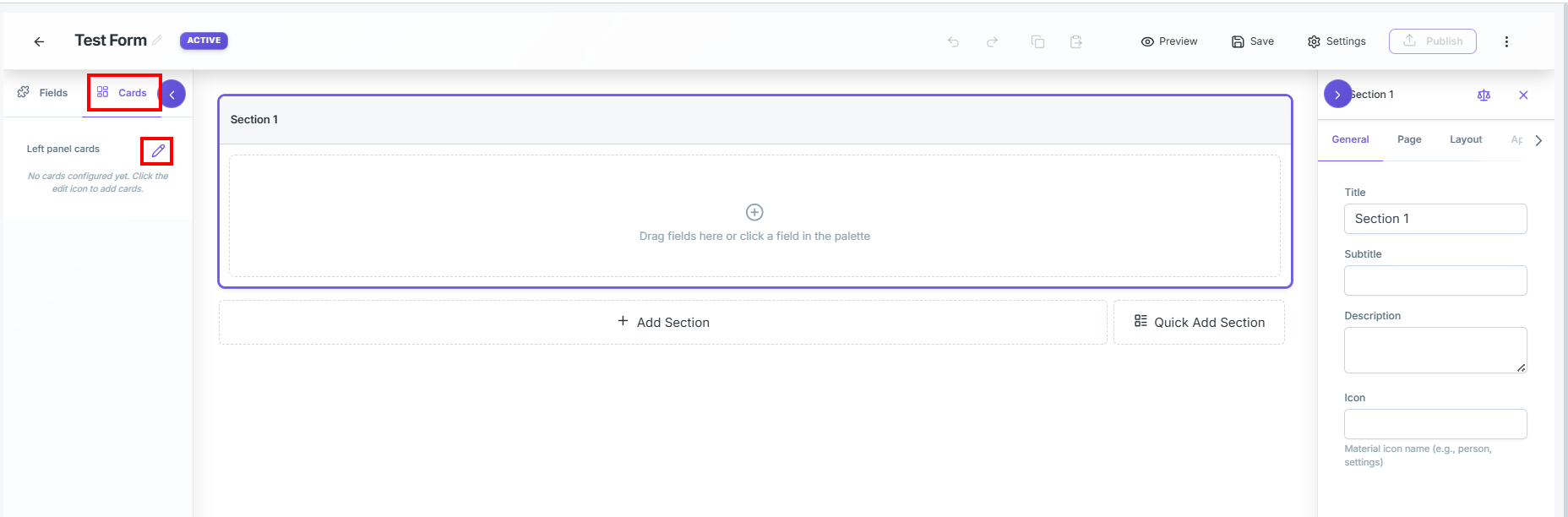
The Enterprise Settings modal is organized into 13 specialized tabs:
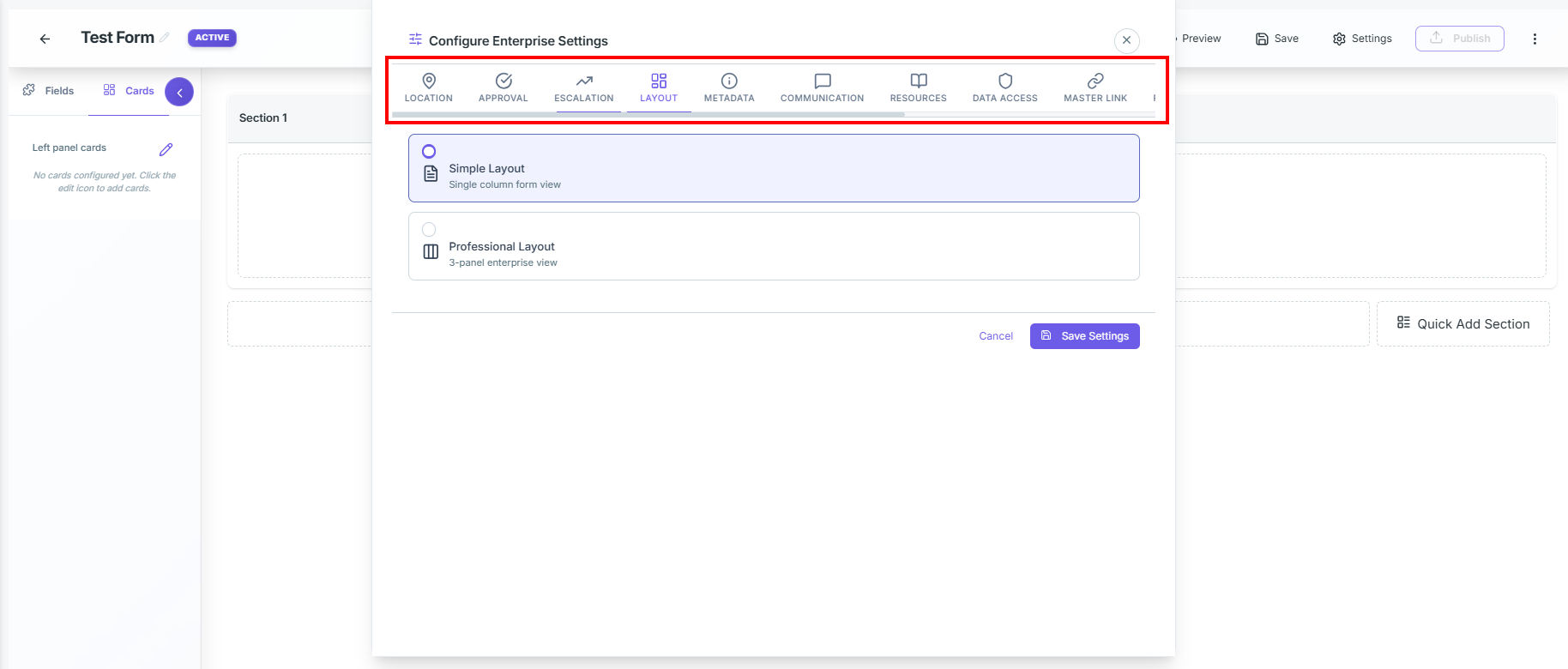
Detailed Tab Configurations for card library
📍
Location
Configure GPS capture, validation rules, fallback options, and manual location entry for accurate responder tracking.
- Enable Location Tracking:By default it is off. If enabled, it will capture the responder's coordinates.Once activated, the following configuration parameters become available:
- Capture Events:Determine when the system attempts to record the user's location.
- Capture on Form Open:Records coordinates immediately when the form loads.
- Capture on Submit:Records coordinates at the moment of submission.
- Capture on Draft Save:Records coordinates whenever a user saves their progress as a draft.
- Requirements:Enforce validation rules and retrieval constraints.
- Require Location (Block Submit if Unavailable):Mandates location tracking; blocks users from submitting if GPS data is unavailable or permissions are denied.
- Minimum Accuracy (meters):Sets the acceptable accuracy threshold in meters.
- Timeout (seconds):Defines the maximum time (in seconds) the system will wait to acquire coordinates before failing.
- Fallback & UI: Customize user interface elements and error recovery behaviors.
- Fallback to IP Geolocation:Estimates location via IP resolution if precise device GPS tracking is blocked or fails.
- Show Location Indicator:Displays a visual icon/indicator to the user reflecting active location services.
- Allow Manual Entry:Permits users to manually key in their address/coordinates if automated acquisition fails.
- Permission Message:A text area to write a custom, user-friendly prompt explaining why the form requires location permissions.
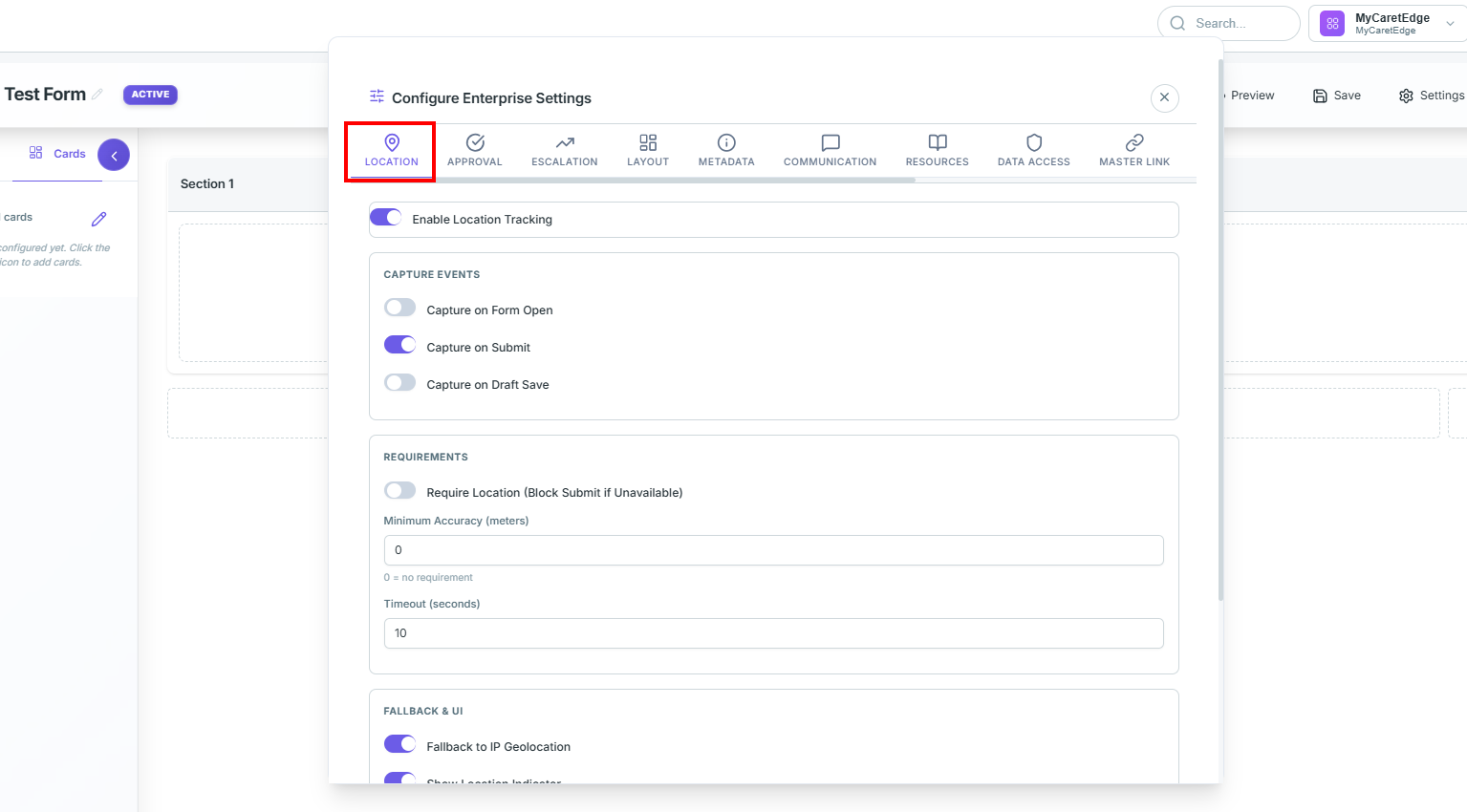
How to Use
- Click the LOCATION tab.
- Toggle Enable Location Tracking to ON.
- You can select the options based on the requirement:
- Capture events
- Requirement – capture data only if location permissions are available.
- Fallback and UI to enable manual entry, show location icon, or use IP geolocation.
- Click Save Settings.
✅
Approval
Configure multi-level approval routing, stage transitions, timeout handling, notifications, and submission validation workflows.
- Enable Approval Workflow: Off by default. If enabled, it seamlessly integrates form submissions into a sequential, multi-stage approval lifecycle.
- Approver Type:Select the routing mechanism for approvals (e.g., Hierarchy Manager).
- Number of Approval Levels:Define how many levels of approval are required (e.g., 1 Level).
- Stage Transition Behavior:
- Approval Behavior: Determines flow control (e.g., Block Stage Transition (Recommended)).
- Lock Record During Pending Approval: When toggled on, locks the submission record to prevent editing while approval is pending.
- Approval Options:
- Require All Approvers at Each Level: Requires every assigned approver at that level to sign off before progressing.
- Allow Comments: Permits reviewers to add notes/comments during approval.
- Require Comments on Rejection: Mandates comments explaining the reason for rejection.
Approval Options:
- Require All Approvers at Each Level: Requires every assigned approver at that level to sign off before progressing.
- Allow Comments: Permits reviewers to add notes/comments during approval.
- Require Comments on Rejection: Mandates comments explaining the reason for rejection.
-
Timeout Settings:
- Auto-Approve on Timeout:Automatically approves the record if the timeout period expires.
- Timeout Hours:Defines the exact timeout duration in hours(default: 24 hours).
- Notifications:
- Notify on Approval:Sends alerts when a submission is approved.
- Notify on Rejection:Sends alerts when a submission is rejected.
Notify on Rejection:Sends alerts when a submission is rejected.
- Notify Submitter:Keeps the original submitter informed about approval status updates.
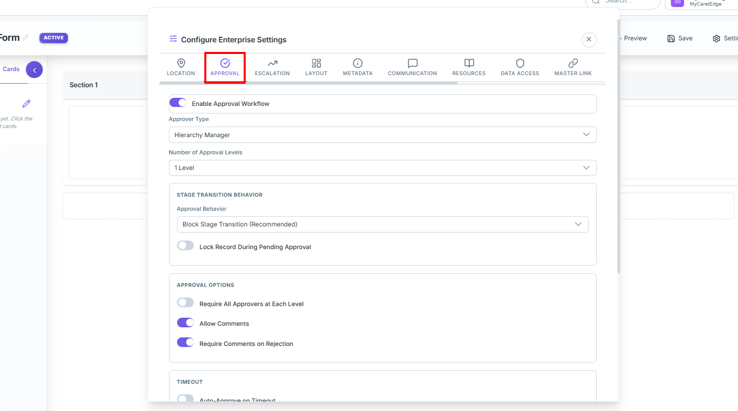
How to Use
- Click the APPROVAL tab.
- Toggle Enable Approval Workflow to ON.
- Configure approval settings:
- Approval type – Role-Based, Hierarchy Manager, User Based, Dynamic
- Number of approval levels
- Stage transition behavior
- Lock record during approval
- Timeout handling
- Approval and rejection notifications
- Click Save Settings.
- Configure approvers/roles in the Approval Workflow module.
Note:Once enabled, agents can view pending approvals under My Approvals in the sidebar.
🚨
Escalation Management
Configure SLA-based escalation rules, automated notifications, priority boosts, and escalation path handling for workflow submissions.
- Enable Escalation:Off by default. If enabled, it triggers automated escalation paths and SLA alerts if a form submission remains in a workflow stage longer than expected.
- Escalation Behavior:
- Auto-Escalate on SLA Breach:Automatically triggers escalation if the configured SLA is breached.
- Allow Manual Escalation:Permits supervisors or authorized users to manually escalate submissions.
- Allow De-Escalation:Allows escalated records to be reverted back to their original state.
- Priority Boost on Escalation:Applies a priority increase during escalation (e.g., +1 Level).
- Notifications:
- Notify on Escalation:Alerts managers or escalation handlers when escalation occurs.
- Notify Original Handler:Sends notifications to the originally assigned handler.
- Escalation Path:
- Path Name:Defines the active escalation workflow path (default: Default).
Note:Advanced configuration of escalation levels and routing is managed directly within the Workflow Editor.
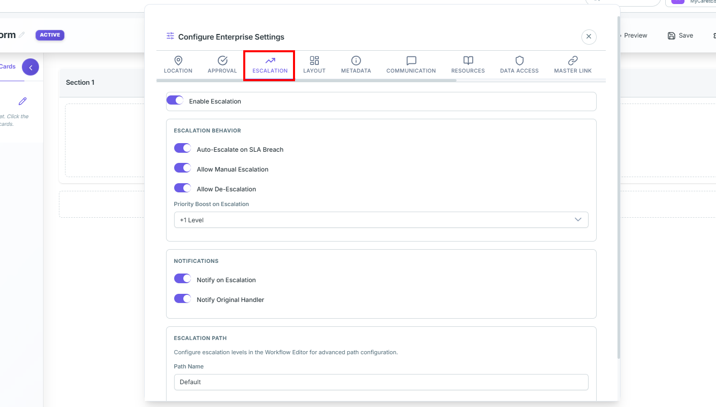
How to Use
- Click the ESCALATION tab.
- Toggle Enable Escalation to ON.
- Configure escalation behavior:
- Auto-Escalate on SLA Breach
- Allow Manual Escalation
- Allow De-Escalation
- Priority Boost on Escalation
- Configure notification preferences:
- Notification on escalation
- Notification to original handler
- Configure escalation path details in the Workflow Editor.
- Click Save Settings.
Note:Escalated records and SLA alerts can be monitored directly from workflow tracking dashboards.
🖥️
Layout Configuration
Configure renderer layout styles, metadata panels,communication panels, headers, and action toolbar behavior.
Defines the visual structure of the form renderer page — controlling how agents interact with forms during submission and review workflows.
Layout Types

- Simple Layout:A clean single-column interface optimized for lightweight workflows and mobile responsiveness.
- Professional Layout:A multi-panel enterprise workspace optimized for high-density operational workflows.

Professional Layout Configuration
-
Left Panel (Metadata):
-
Enable Left Panel:
Displays metadata and contextual information
on the left side.
-
Panel Width:
Configure panel width
(e.g., Medium 320px).
-
Components:
- Form Metadata
- Customer Info
- Activity Timeline
- Property Cards
-
Right Panel (Communication):
- Enable Right Panel: Displays communication and tracking modules.
- Panel Width: Configure communication panel width.
- Components:
- Communication
- Attachments
- Extensions
- Notes
- Resources
-
Header Options:
- Show Back Button
- Show Breadcrumb
- Show SLA Timer
- Show Status Badge
-
Action Toolbar:
-
Toolbar Position: Configure toolbar placement (Top / Bottom / None).
- Show Save Draft Button
- Show Cancel Button
- Show Submit Button
How to Use
-
Select either
Simple
or
Professional layout.
-
Configure left and right workspace panels.
-
Configure header visibility options.
-
Configure toolbar buttons and positioning.
-
Click Save Settings.
🗂️
Metadata
Configure ETL dataset mappings and dynamic reviewer-side metadata panels for enhanced submission context visibility.
Configure what dynamic background information displays in the left-hand panel of the submission reviewer page.
- ETL Dataset Integration: Select from available ETL datasets configured in the system. The selected dataset fields will automatically appear in the metadata panel during submission review.
- Dataset Binding: Allows metadata linking with customer master records, operational datasets, or lead databases.
- Default State: Displays -- None -- when no dataset is selected.
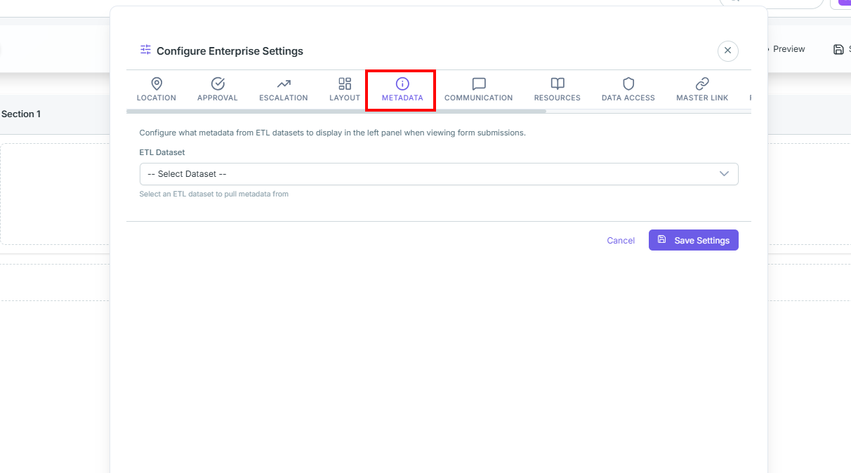
How to Use
- Click the METADATA tab.
- Select the required ETL Dataset from the dropdown.
- Click Save Settings.
- Ensure the Form Metadata component is enabled inside the Layout tab.
💬
Communication
Configure SMS, Email, WhatsApp, Call integrations, recipient mapping, and communication history tracking.
Configure communication channels and historical interaction tracking for form submissions.
- Default Recipient:
- Recipient Source: Select the source for recipient details (e.g., Form Field).
- Recipient Field: Specify the form field containing phone number or email information.
- Communication Channels:
- SMS: Configure automated outbound text messaging.
- Email: Configure transactional and workflow emails.
- WhatsApp: Configure WhatsApp Business integrations.
- Web WhatsApp (Click-to-Chat):
- Opens local WhatsApp application with pre-filled messages.
- Requires no API key or WhatsApp Business setup.
- Call: Configure outbound call and dialer integrations.
- History Panel Configuration:
- Interaction History: Displays user-agent interaction timelines.
- Stage History: Tracks workflow stage changes and transitions.
- Communication History:
- SMS History
- WhatsApp History
- Email History
- Call History
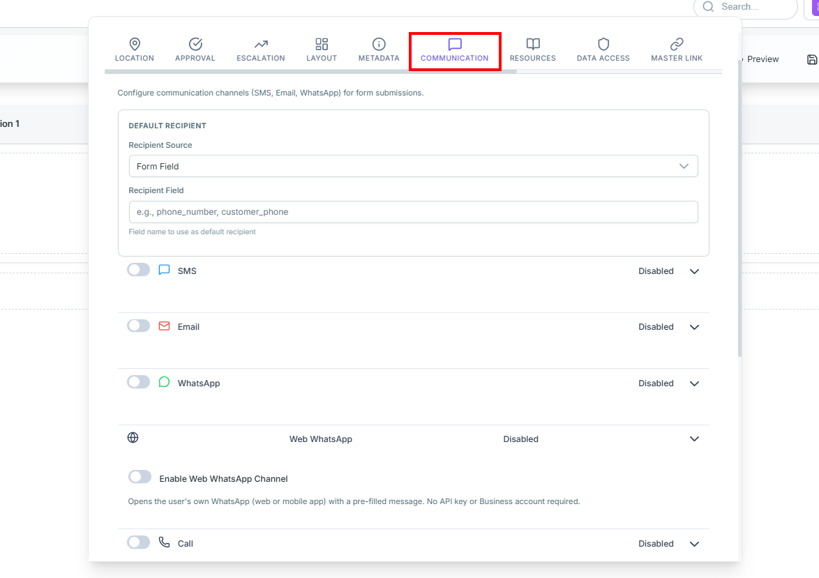
How to Use
- Configure the default recipient source and field mapping.
- Enable required communication channels.
- Select manual or automatic sending behavior and assign templates.
- Configure call integration if dialer support is enabled.
- Enable required history tracking toggles.
- Click Save Settings.
📚
Resources
Configure SOPs, training resources, shared workflow attachments, and transaction file visibility across forms.
Configure supporting resources, SOPs, and shared transaction attachments within the agent workspace.
- Resources Panel:
- Enable Resources Panel: Enables the quick-reference resources section inside the form renderer.
Note: Supports SOPs, training videos, guide links, and embedded instructions directly inside the workflow.
- Transaction Upload Section: Configure cross-form document sharing within the same workflow process.
- Enable Transaction Upload Section: Allows files uploaded in one form to become visible across related workflow forms.
- Allow users to download transaction files: Controls whether users can download shared files.
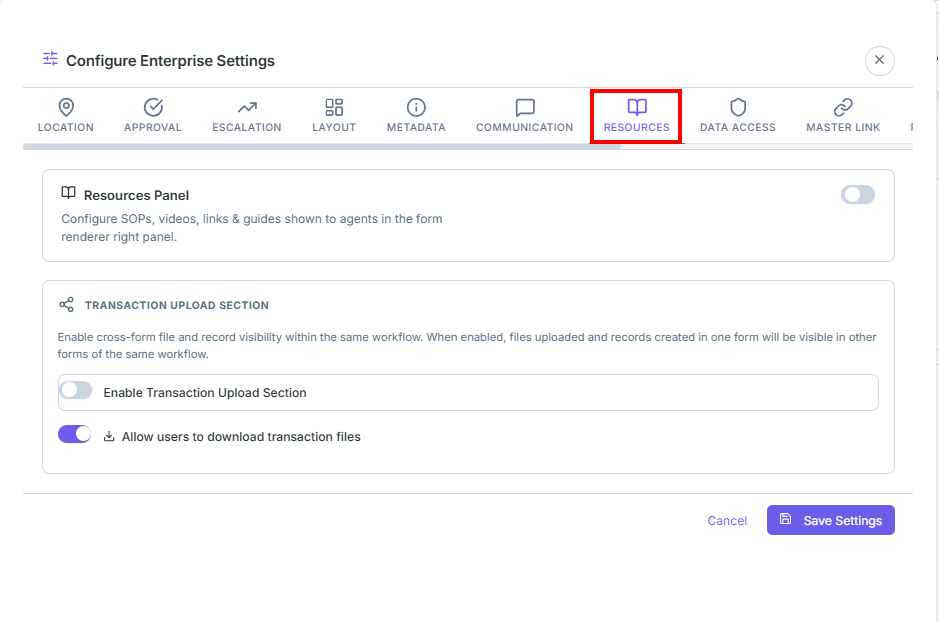
How to Use
- Enable Resources Panel.
- Enable Transaction Upload Section.
- Configure download permissions.
- Click Save Settings.
🔐
Data Access
Configure role-based record visibility, hierarchy-level access, and enterprise data governance controls.
Configure visibility rules for records and workflow data access.
Record Visibility
- All Records: All users can access all submissions.
- Assigned Only: Users see only assigned records.
- Reporting Hierarchy: Managers can access subordinate records.
Note: TenantAdmin, OrgAdmin, and SuperAdmin roles always have full access.
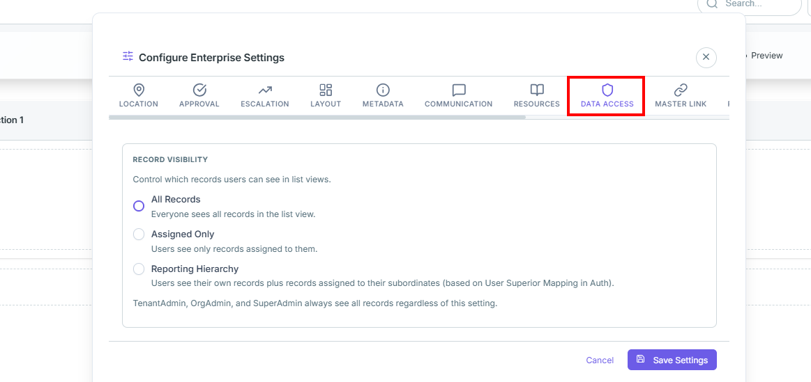
How to Use
- Click the DATA ACCESS tab.
- Select the required visibility mode.
- Click Save Settings.
🔗
Master Link
Configure parent-child form relationships, synchronized data access, and linked master record visibility.
Establish relationships between this form and linked master forms.
- Master Form:Select the parent/master form template.
- Link Type: Configure auto-detect or field-reference linking.
- Sync Mode:Set read-only or bidirectional editing access.
- Panel Title:Customize the linked panel heading.
- Section Configuration: Configure section visibility and field access.
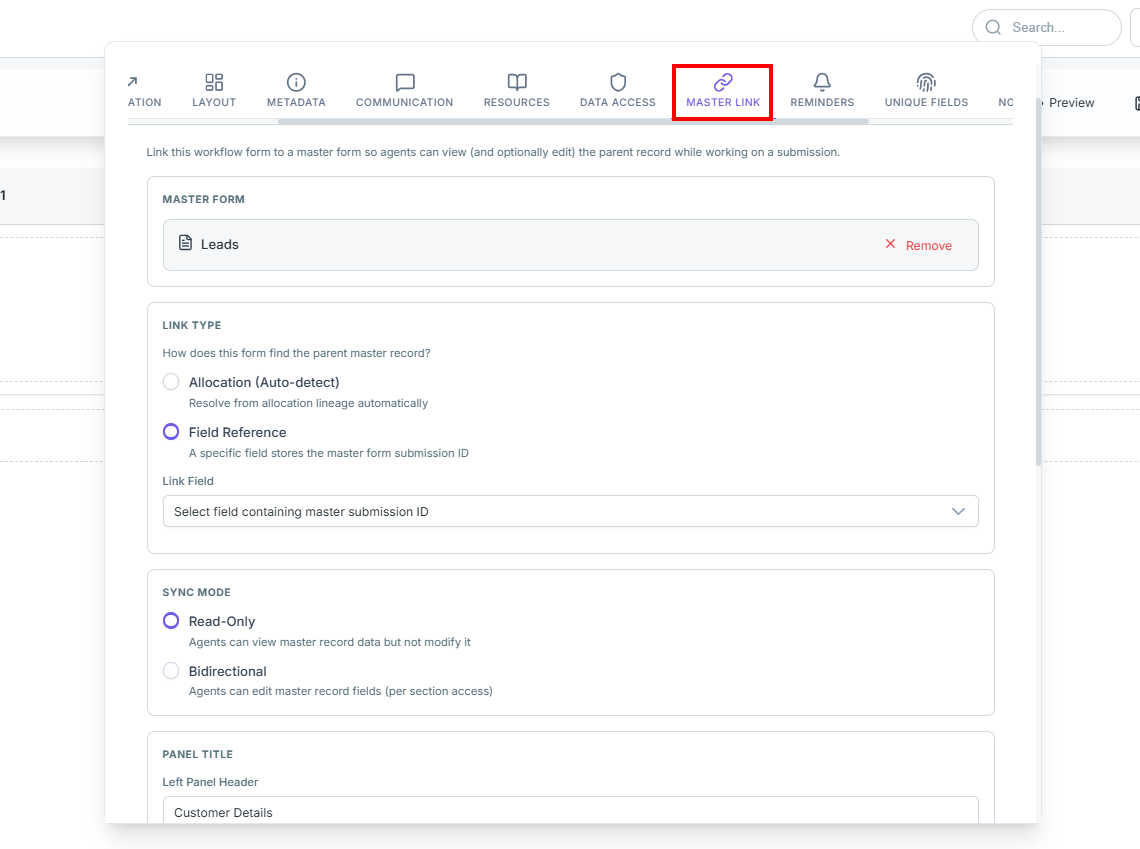
How to Use
- Select a master form.
- Configure link type and sync mode.
- Customize section access settings.
- Click Save Settings.
⏰
Reminders
Configure follow-up reminders,date-based notifications,and workflow follow-up automation.
Configure reminder rules for operational follow-ups and pending tasks.
- Date Field: Select the monitored date field.
- Reminder Timing: Define before/after notification timing.
- Target Users: Select notification recipients.
- Message / Channel: Configure notification delivery.
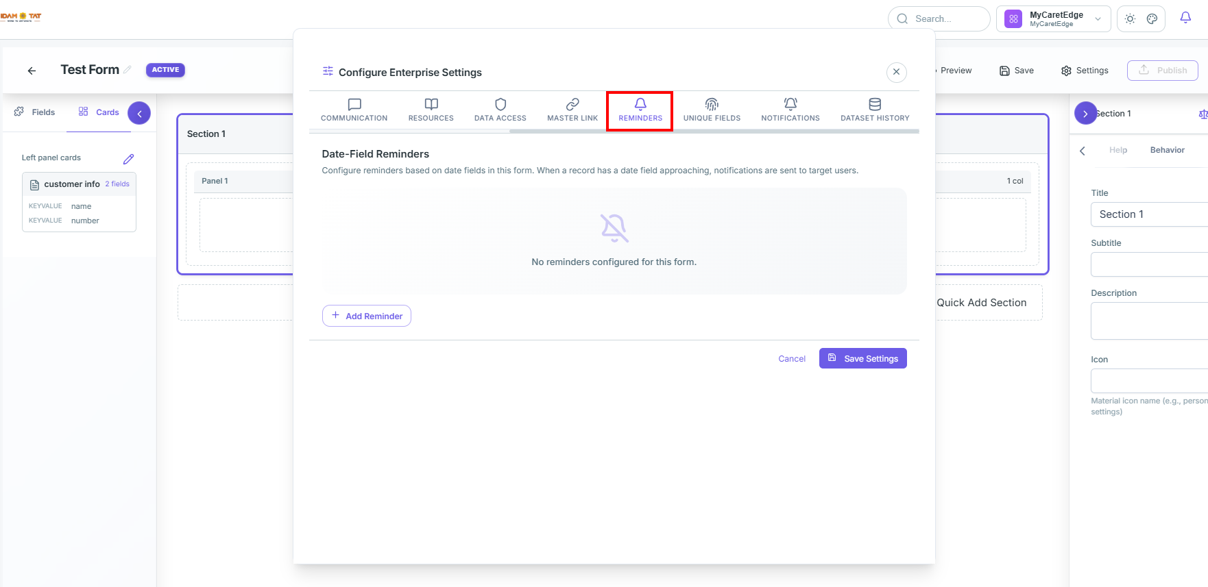
How to Use
- Click + Add Reminder.
- Select the date field.
- Configure timing and recipients.
- Click Save Settings.
🆔
Unique Fields
Configure duplicate prevention rules, composite unique keys,and validation handling for submissions.
- Enable Unique Field Validation: Activates duplicate validation checks.
- Unique Key Fields: Select one or more fields for uniqueness validation.
- Duplicate Handling: Block or warn on duplicate submissions.
- Case-Insensitive Comparison: Ignore case differences during validation.
- Custom Error Message: Configure custom validation messages.
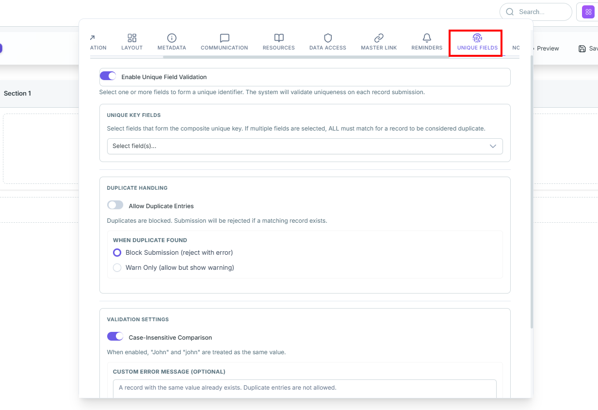
How to Use
- Enable unique field validation.
- Select unique key fields.
- Configure duplicate handling rules.
- Click Save Settings.
🔔
Notifications
Configure automated alerts,trigger-based notification rules,delivery channels,and recipient targeting.
- Enable Notification Rules:Activates automated notification workflows.
- Trigger Events:Configure events like submit, approval,rejection, or status changes.
- Target Audience:Configure recipients and roles.
- Channels:Configure In-App, Push, and Email delivery.
- Conditions:Apply filter-based rule execution.
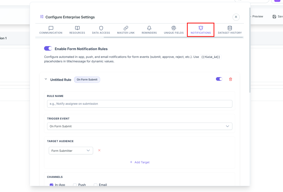
How to Use
- Enable notification rules.
- Add or edit notification rules.
- Configure triggers and recipients.
- Click Save Settings.
🗄️
Dataset History
Configure historical dataset tracking,operational audit visibility,and historical record panels.
Configure external dataset history sources for historical tracking and audit visibility.
- Enable Dataset History:Enables the history panel inside the renderer.
- History Sources:Configure one or more history datasets.
- Button Name:Configure the displayed history tab label.
- Page Size:Define records displayed per page.
- Dataset:Select the target history dataset.
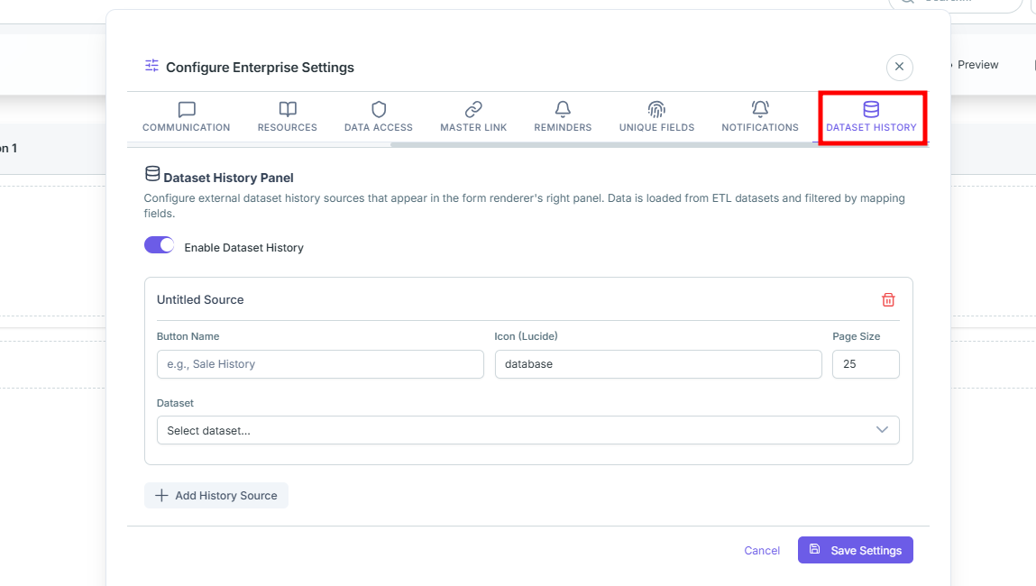
How to Use
- Enable dataset history.
- Add a history source.
- Configure dataset and page size.
- Click Save Settings.
- Once the form is created you can save the form the preview it for reviewing the view that user will experience while working.
- Once the form is finalized you can click on Publish button to make the form live.
- Once the form is publish no changes can be done.
Restore the previous Version
- If the wrong form is published the previous Version can be restores by reaching out to administrators’ team.
Conditional Questions Configuration
In multi-step CRM forms, you often need to show, enable, or require certain fields dynamically based on a user's previous selection. This is commonly referred to as conditional questioning or disposition-based logic (e.g., if a lead is marked as "Interested", a follow-up date and product preference field should appear and become mandatory).
The Three Modes of Conditional Control
You can control dependent fields in three distinct ways depending on your business requirements:
| Control Type |
How it Works |
Practical Business Example |
| 1. Conditional Visibility |
The dependent question is hidden by default and only appears when specific criteria in the previous question are met. |
If Is this a Valid Lead? is answered with "Yes", then the Lead Grade dropdown is displayed. |
| 2. Conditional Enablement |
The dependent question remains visible on the screen but is grayed out (read-only) until the target criteria are met. |
The Call Back Date is visible but non-interactive until Lead Status is set to "Follow-up Required". |
| 3. Conditional Required |
The dependent question becomes mandatory (displays a red asterisk * and blocks submission) only when specific criteria are met. |
The Rejection Reason field is optional normally, but becomes strictly Required if Lead Status is set to "Rejected". |
Step-by-Step Configuration Guide
To apply conditional logic, validation, or special behavior properties to a field, use the Field Action/Tune Menu in the builder:
Step 1: Select the Target Field
Click on the question/field on the central canvas that you want to apply the validation or conditional logic to (the dependent question).
Look at the Right Properties Panel. At the very top-right of the panel (just to the left of the ✕ close button), locate and click the Tune / Configuration (three-line sliders) icon.
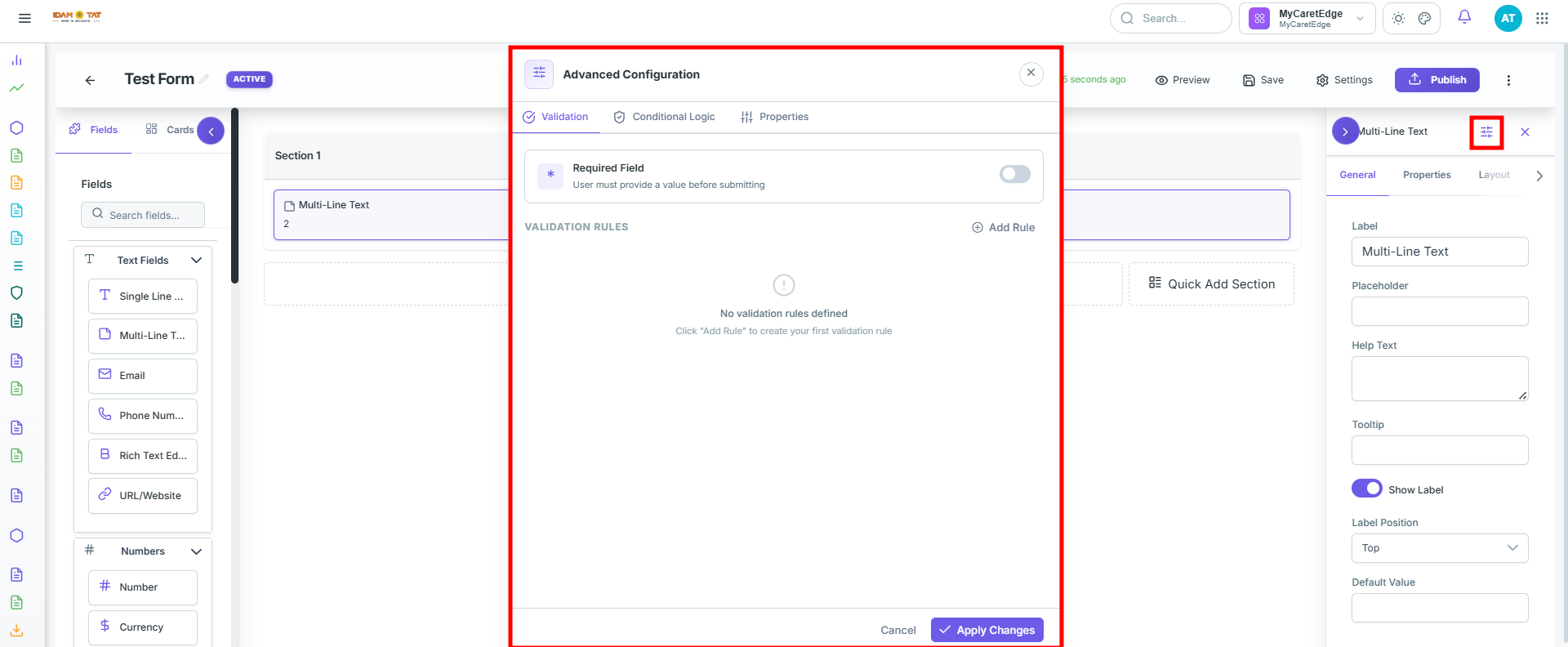
This will reveal three advanced configuration tabs:
1. Validation
Allows you to enforce data integrity and make questions mandatory.
- Required Toggle: Enabling this makes the question mandatory by default, adding a red asterisk
* next to the label.
- Validation Rules: Define custom regex patterns (e.g., for custom ZIP codes or ID formats).
- Error Messages: Customize the alert message shown to the user if they try to submit the form without completing this question.
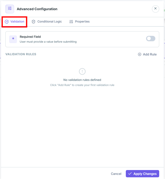
2. Conditional Logic
Allows you to define rules that trigger changes in the field based on other inputs.
- Rule Builder: Click + Add Condition to configure your logic.
- Structure: Set rules in a structured
IF [Previous Field] [Operator] [Value] THEN [Action] format.
- Example Rule:
IF [Is this a Valid Lead?] EQUALS [Yes] THEN [Show Field].
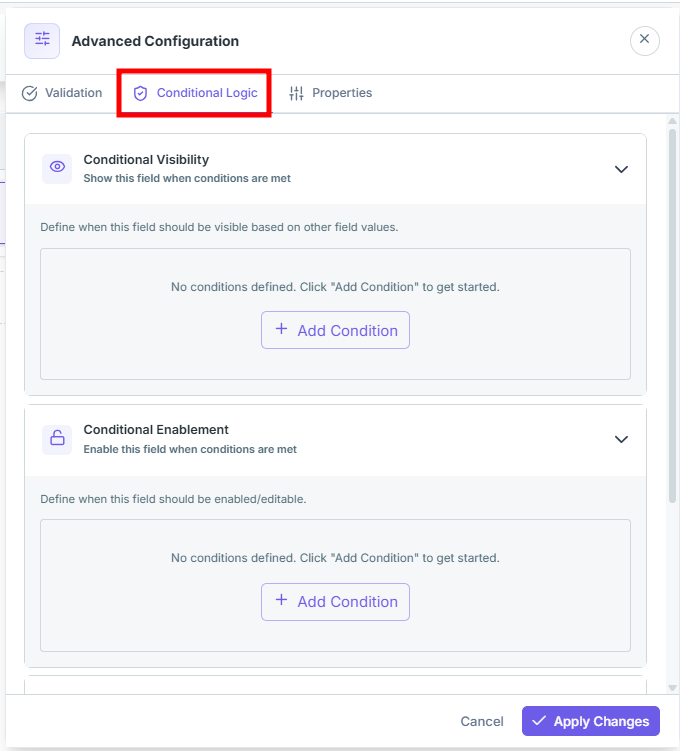
3. Properties
Controls the base state, behavior, and focus options of the field when it is initialized.
- Visible: Sets whether the field is shown on initial form load.
- Read-Only: Prevents users from modifying the field value while keeping it visible.
- Disabled: Renders the field grayed-out and non-interactive by default.
- Auto Focus: Automatically focuses the user's cursor on this field when the page or section loads.
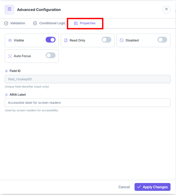
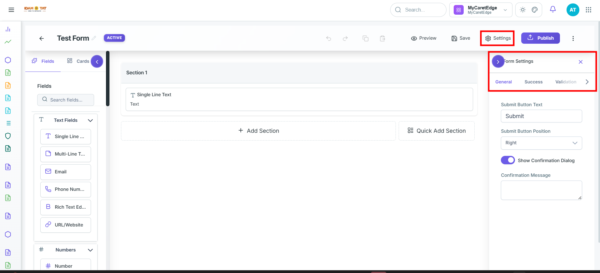
- The Settings button opens advanced form-level configuration.
1. General
- Submit Button Text — the label displayed on the submit button, set to "Submit" by default. You can customize it to anything like "Send", "Register", "Book Now", etc.
- Submit Button Position — controls where the button is aligned on the form. There are three options:
- Left — button sits on the left side
- Center — button is centered
- Right — button sits on the right side
- Show Confirmation Dialog — a toggle (off by default) that, when enabled, shows a confirmation popup/dialog to the user after they hit submit, typically to confirm their response was received (e.g., "Thank you! Your form has been submitted.")
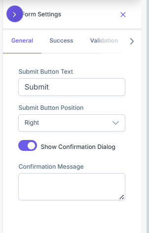
2. Success
- Success Action — defines what happens after submission. Four options:
- Show Message — displays a thank-you or confirmation message on the screen
- Redirect to URL — sends the user to a specific webpage after submitting
- Message + Redirect — first shows a message, then redirects the user to a URL
- Redirect to Redirect List — redirects users to different URLs based on conditions/rules (useful for logic-based routing)
- Success Title — the heading shown on the confirmation screen (e.g., "Thank You!")
- Success Message — the body text shown after submission (e.g., "Your response has been recorded. We'll get back to you shortly.")
- Show Reference Number — a toggle that, when enabled, displays a unique reference/tracking number to the user after they submit, useful for support tickets, bookings, or applications
- Reference Number Prefix — lets you add a custom prefix to the reference number (e.g., "REF-" or "TKT-") to make it more identifiable
- Show "Submit Another" Button — a toggle that, when enabled, displays a button on the confirmation screen allowing the user to go back and fill out the form again
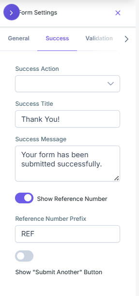
3. Validation
- Error Display Mode — defines how errors are presented. Three options:
- Inline — errors appear directly below each individual field that has an issue
- Summary Only — all errors are grouped and shown together in one summary block
- Both — shows errors both inline under each field and in a summary block
- Error Summary Position — controls where the error summary block appears on the form. Two options:
- Top — summary appears above the form fields
- Bottom — summary appears below the form fields
- Auto Scroll to First Error — a toggle (on by default) that automatically scrolls the page to the first field with an error when the user tries to submit, so they don't miss it
- Highlight Error Fields — a toggle (on by default) that visually highlights fields with errors (typically with a red border or color), making them easy to spot at a glance
- Max Retry Attempts — sets the maximum number of times a user can attempt to submit the form, defaulting to 3. After reaching the limit, further submission attempts may be blocked or flagged
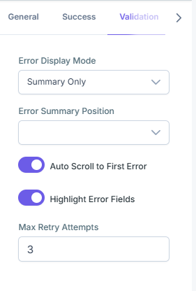
4. Draft
- Allow Save as Draft — a toggle that, when enabled, lets users save their partially filled form and come back to complete it later without losing their progress
- Enable Auto-Save — a toggle that automatically saves the user's form progress at regular intervals in the background, reducing the risk of data loss
- Auto-Save Interval (seconds) — defines how frequently the form auto-saves, with a range of 10 to 3600 seconds (1 hour). For example, setting it to 30 would save the draft every 30 seconds
- Draft Retention (days) — controls how long a saved draft is kept before it expires and is deleted. For example, setting it to 7 means drafts are automatically removed after 7 days if not submitted
- Warn on Unsaved Changes — a toggle that, when enabled, shows a warning prompt if the user tries to close or navigate away from the form without saving or submitting, preventing accidental data loss
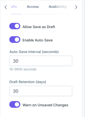
5. Access
- Require Authentication — a toggle (on by default) that requires users to be logged in before they can access and submit the form, ensuring only verified/known users can respond
- Allow Anonymous Submissions — a toggle (off by default) that, when enabled, allows users to submit the form without being identified or logged in, useful for public surveys or feedback forms
- Enable CAPTCHA — a toggle (off by default) that, when enabled, adds a CAPTCHA challenge (e.g., "I'm not a robot" checkbox or image puzzle) to the form to block spam bots and automated submissions
- Rate Limit (per hour) — sets the maximum number of submissions allowed from a single user or IP address within one hour, helping prevent spam, abuse, or flooding of form responses. For example, setting it to 5 would allow no more than 5 submissions per hour
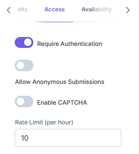
6. Availability
- Available From — sets a specific date and time when the form becomes active and accessible to users. Before this date, the form will not accept responses, useful for scheduling form launches in advance
- Available Until — sets a specific date and time when the form stops accepting responses and closes automatically. After this date, users will no longer be able to submit the form, useful for deadlines, event registrations, or limited-time surveys
- Timezone — defines the timezone used for the Available From and Available Until date/time settings, ensuring the schedule is accurate for your target audience's region
- Max Total Submissions — sets a cap on the total number of responses the form will accept. Once the limit is reached, the form automatically closes and no further submissions are allowed, useful for limited-seat registrations or contests
- Maintenance Mode — a toggle that, when enabled, temporarily takes the form offline and displays a maintenance message to visitors instead, allowing you to make edits or updates without permanently closing or deleting the form.
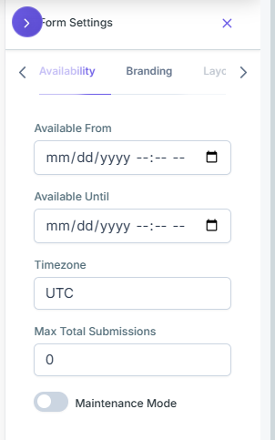
7. Branding
- Theme — lets you choose an overall design theme or template for the form, setting the base visual style including fonts, spacing, and layout
- Primary Color — sets the main accent color used throughout the form (e.g., buttons, active fields, highlights, progress bars). Includes a Color Palette with 125 preset colors to choose from, or a custom option
- Secondary Color — sets a complementary color used for supporting elements (e.g., borders, hover states, icons). Also includes a Color Palette with 125 preset colors to choose from, or a custom option
- Background Type — defines the type of background for the form, such as:
- Solid color
- Gradient
- Image
- None/Transparent
- Background Value — sets the actual value for the chosen background type, such as a hex color code, gradient definition, or an image URL
- Logo URL — lets you add your brand/company logo to the form by entering the URL of the logo image, giving the form a professional and branded appearance
- Show Branding — a toggle that controls whether the platform's own branding/logo is displayed on the form. Turning it off gives the form a cleaner, white-labeled look
- Custom CSS — an advanced text area allowing you to write your own CSS code to fully customize the form's appearance beyond the built-in options, with a maximum limit of 10,000 characters
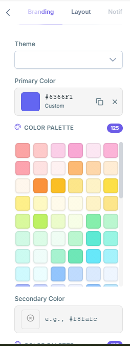
8. Layout
- Layout Type — controls how the form pages and sections are displayed to the user. Three options:
- Stepper — breaks the form into distinct steps with navigation buttons (Next/Back), showing one step at a time with a step indicator
- Progress Bar — similar to stepper but shows a visual progress bar at the top indicating how far along the user is in completing the form
- Single Scroll — displays all form fields on one continuous scrollable page without any step separation
- Max Width — sets the maximum width of the form container, controlling how wide the form stretches on larger screens. Keeping it constrained (e.g., 600px or 800px) improves readability on wide displays
- Horizontal Padding — controls the spacing on the left and right sides inside the form container, creating breathing room between the form content and its edges
- Vertical Padding — controls the spacing on the top and bottom inside the form container, determining how much space sits above and below the form content within its boundaries
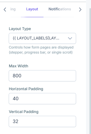
9. Notification
- Notify Form Owner — a toggle (on by default) that automatically sends an email notification to the form owner/creator whenever a new submission is received, keeping them informed of new responses in real time
- Send Confirmation Email to Submitter — a toggle (off by default) that, when enabled, automatically sends a confirmation email to the person who filled out and submitted the form, acknowledging that their response was successfully received
- Notification Template ID — lets you specify a custom email template (by its ID) to be used for the notification emails, allowing you to use pre-designed branded templates instead of the default system email format, for a more professional and consistent communication style
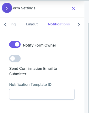
10. Enterprise
- Location (Disabled) — tracks where form submissions are made from geographically, useful for field teams, site inspections, or location-based data collection
- Approval (Disabled) — enables an approval workflow where submitted forms go through a review/sign-off process before being finalized, useful for multi-step authorization flows
- Escalation (Disabled) — sets up automatic escalation rules, such as flagging or forwarding a submission to a higher authority if it meets certain conditions or goes unreviewed for too long
- Layout (Simple) — controls the enterprise-level layout configuration of the form, currently set to Simple mode
- Metadata (Not Set) — allows you to attach additional hidden data/context to form submissions, such as department IDs, project codes, or system tags
- Communication (0 channels) — configures communication channels (e.g., Slack, email, SMS, webhooks) to notify teams or trigger messages when a form is submitted
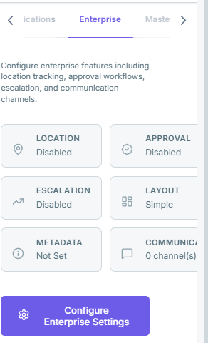
This is the Master Menu settings panel, which controls how the form appears in the application's sidebar navigation. Here's a breakdown:
- Show in Sidebar Menu — a toggle (on, shown in blue/purple) that, when enabled, makes this form visible as a menu item in the sidebar navigation, allowing users to quickly access it from anywhere in the app
- Master Menu Label — the display name shown for this form in the sidebar menu. Currently set to "Test 1". If left empty, it defaults to "View [Form Name]"
- Master Menu Icon — lets you specify a Material Design icon to display alongside the menu label in the sidebar. Currently set to "view_list". Examples of valid icon names include:
view_listcontact_pagedescription
- Display Order — a numeric value that controls where this form appears in the sidebar menu relative to other items. Currently set to 0. Lower numbers appear higher/first in the menu
- Master Menu Item Preview (info section at the bottom) — a live preview showing exactly how the menu item will appear in the sidebar:
- Label: Test 1
- Icon: view_list
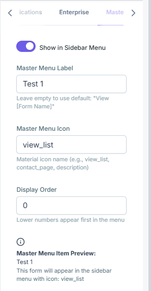
Note: Any form builder can be made as a Master Form.
1
Create form
Name it and begin in Draft status
2
Configure layout & fields
Add sections, input fields, and structure
3
Configure validation
Set required fields, rules, and error messages
4
Preview form
Review the form exactly as respondents will see it
5
Save draft
Preserve your work before going live
6
Publish
Click Publish in the top bar to go live
Once published:
✓
Status changes from DRAFT → ACTIVE
The form is now live and accepting responses
✓
Form becomes accessible
Based on configured visibility, scheduling, and auth settings
Frequently Asked Questions
Q: Can I edit a form after it has been published?
A: No. Once a form is published, it becomes locked. Contact your administrator to restore a previous version if changes are needed.
Q: What is the difference between Conditional Visibility and Conditional Enablement?
A: Conditional Visibility hides the field entirely until the condition is met. Conditional Enablement keeps the field visible but grayed out (disabled) until the condition is met.
Q: Can I reuse dropdown values across multiple forms?
A: Yes. Use Option Sets — centrally managed lists that can be referenced across any form in the system.
Q: What happens to existing submissions if a form is deactivated?
A: Existing submissions are preserved. Deactivating a form only prevents new submissions from being accepted.
Q: Can the AI-generated form be edited after generation?
A: Yes. The AI creates an initial structure that can be fully edited in the Form Builder Editor before publishing.
Q: What is the difference between Form Name and Display Name?
A: The Form Name is the internal system identifier (used in URLs and integrations). The Display Name is the user-facing title shown on the form itself.
Q: Can a form span multiple pages?
A: Yes. Use the Page Tab in Section configuration to assign sections to different pages, creating a multi-page form experience.
For further assistance, reach out to your system administrator or support team.